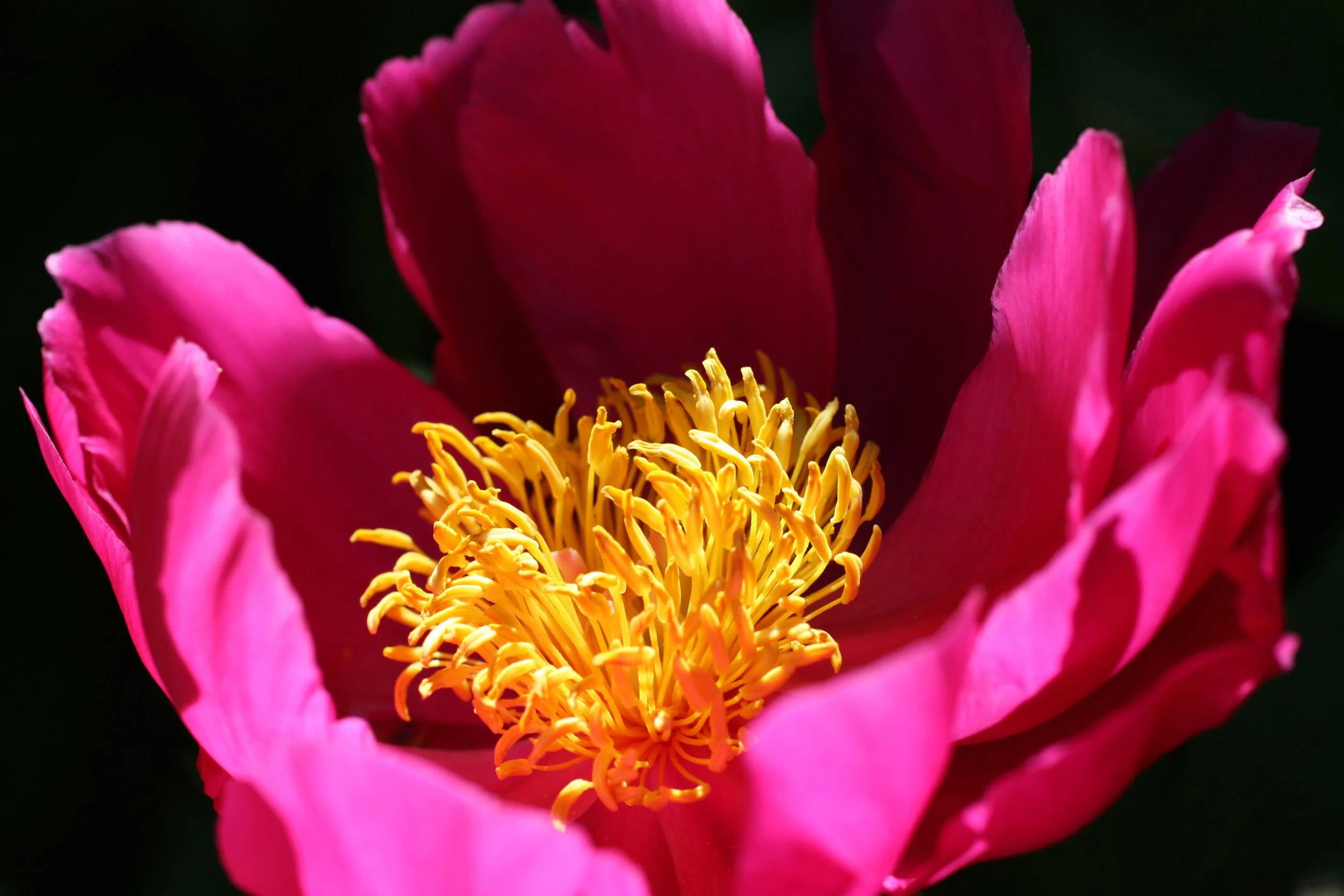
Will they like my Colors?

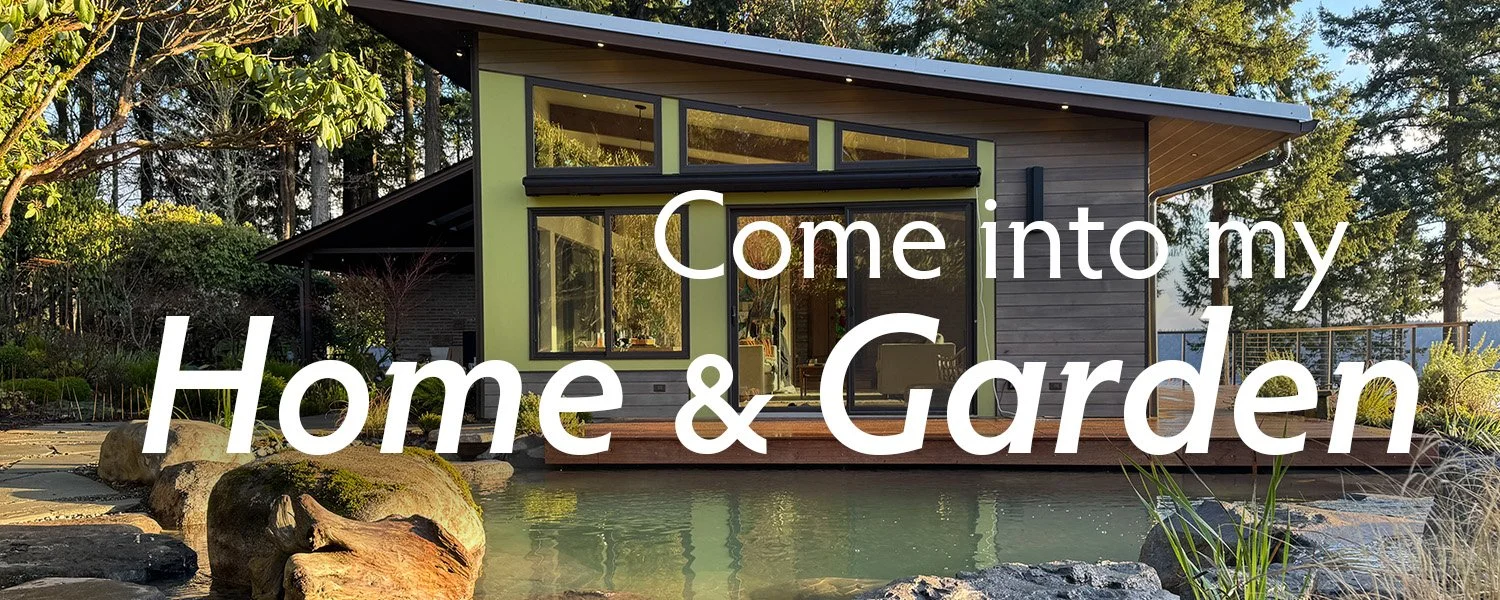
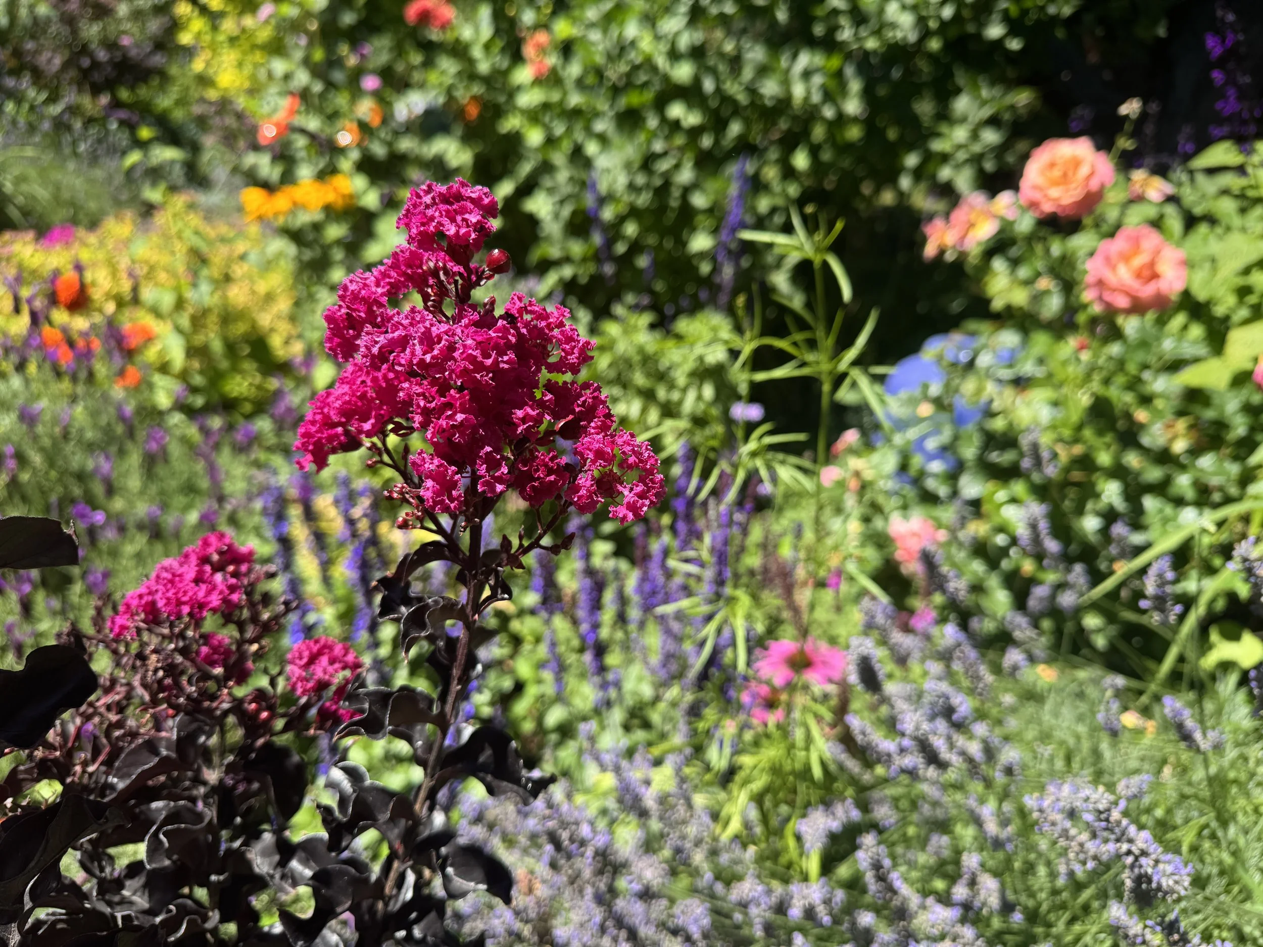
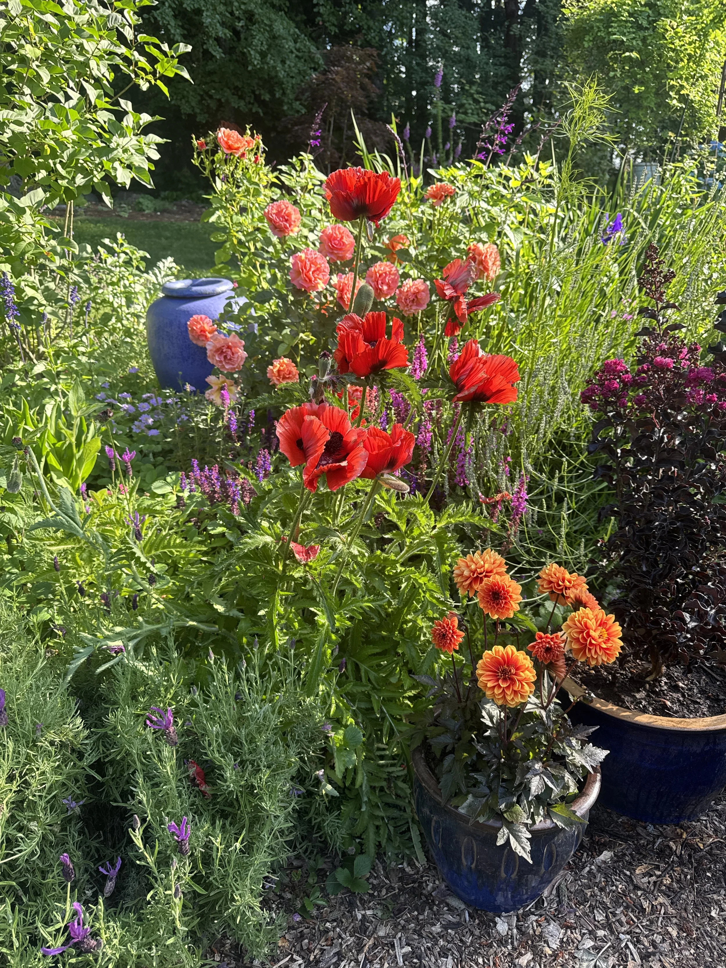
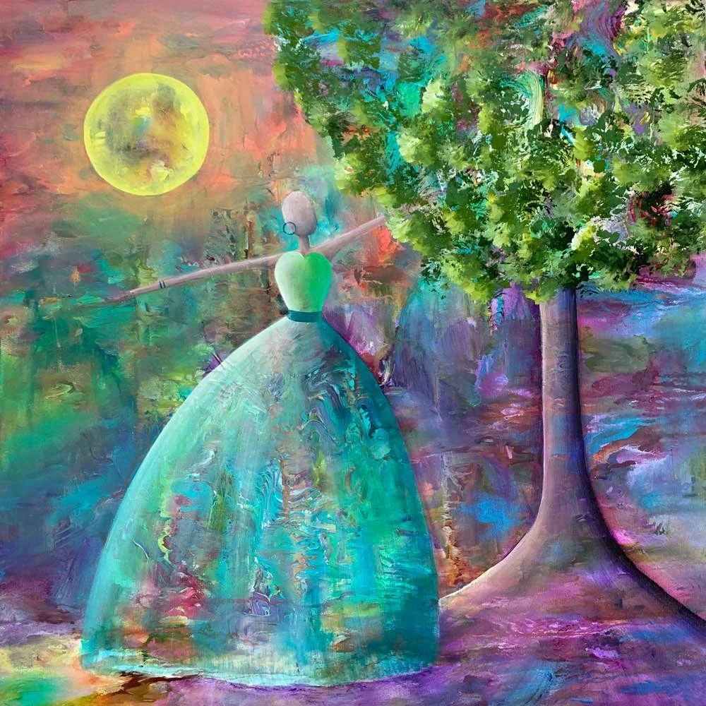
Bold colors in my vibrant Bohemian Garden
The choice to put something out there in the world for others to see is an act of vulnerability, of expectation, of hope, of anxiety, of bravery.
A year out, it seemed so easy to say yes to multiple tours through our garden. But as the day approached, and nature threw out her cacophony of challenges, all of my imposter syndrome fears bubbled to the surface:
What if our gardens weren’t good enough? What if my cottage gardens were too chaotic? The colors too different? Would it be obvious that I don’t know how to place the right plant in the right place, but rather chose color over any other consideration? I can’t even remember the names of all the plants. Would people see through me? Would they focus on the projects we hadn’t finished and missed the ones we had?
My biggest fear — will people like my chaos of colors?
Spoiler alert — they did! Scroll down for a tour with gardening YouTube star: Kate David of @HelloGarden
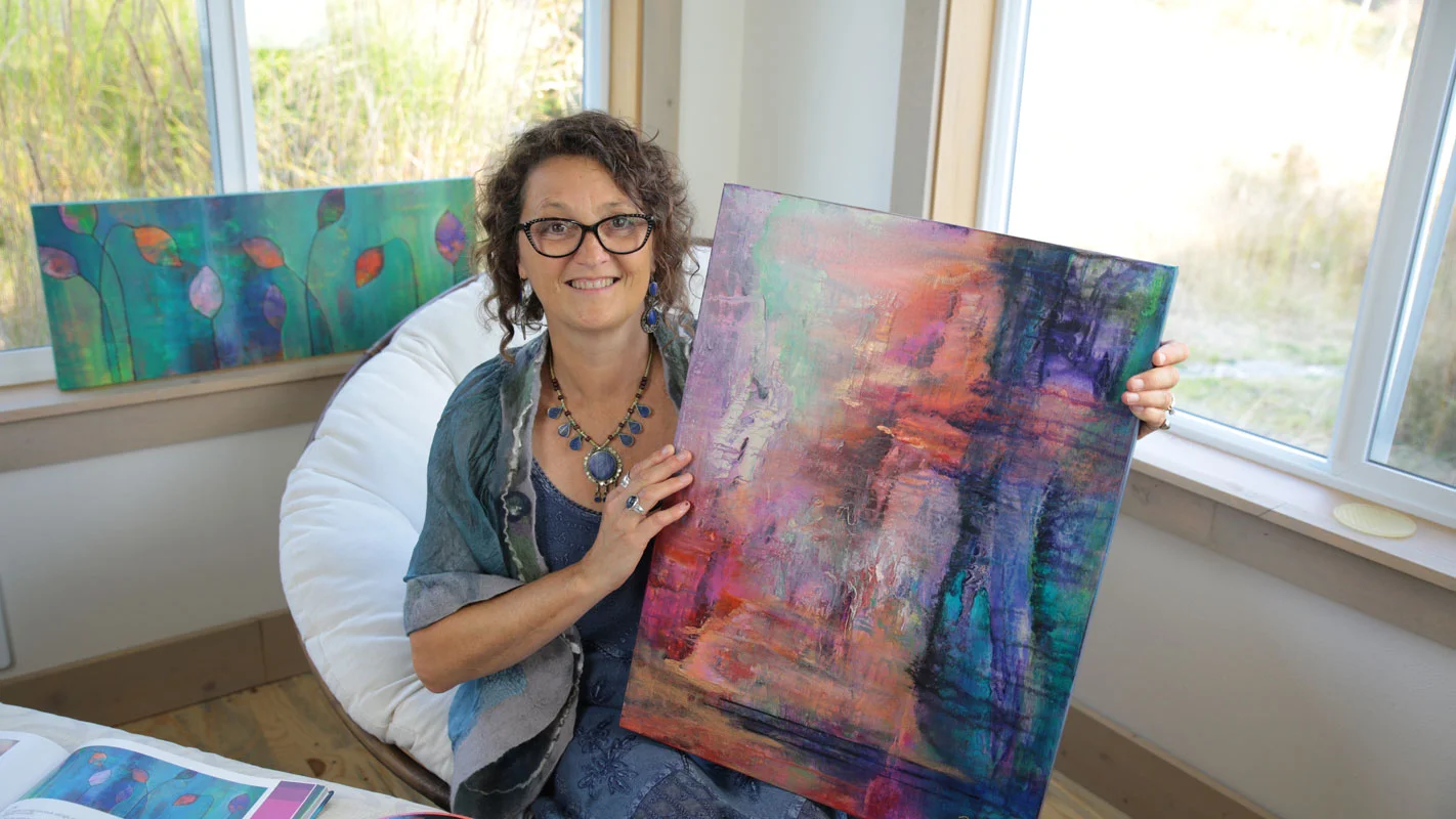
As you know, I LOVE playing with color and can’t really stick with a single palette. And when I do place my colors they aren’t in large gentle swaths.
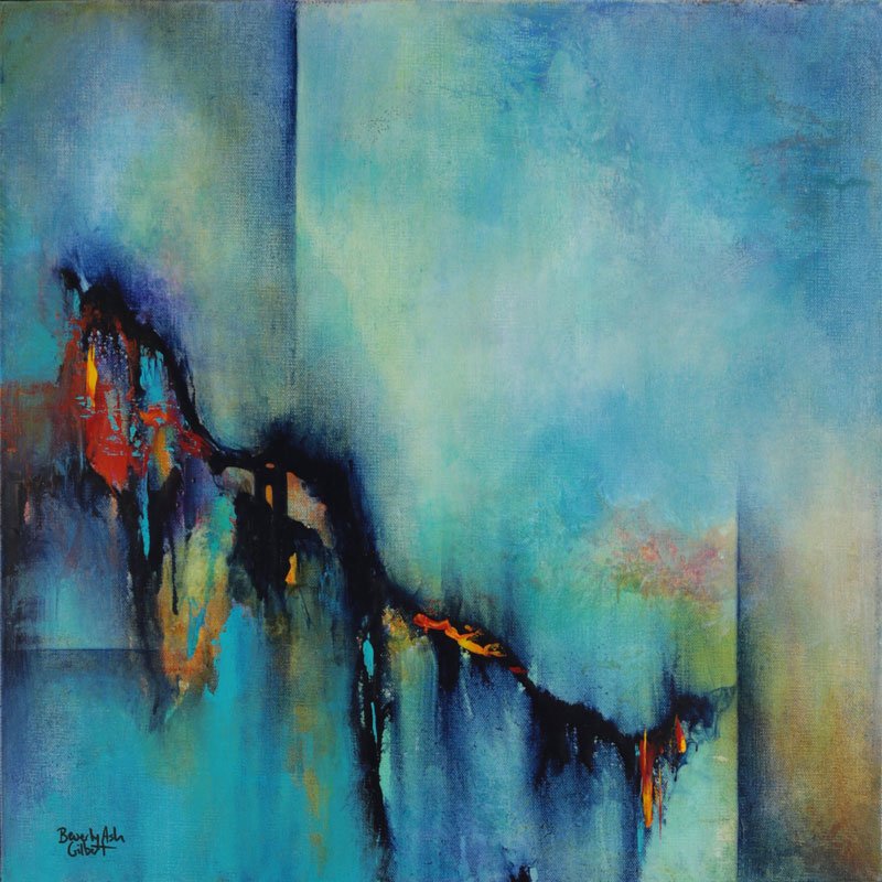
Instead I throw color into the garden the way I throw paint onto a canvas - by grabbing different, unique and crazy colors, combining them in unexpected ways, then moving them around and sprinkling more and more and more color in until it feels right.
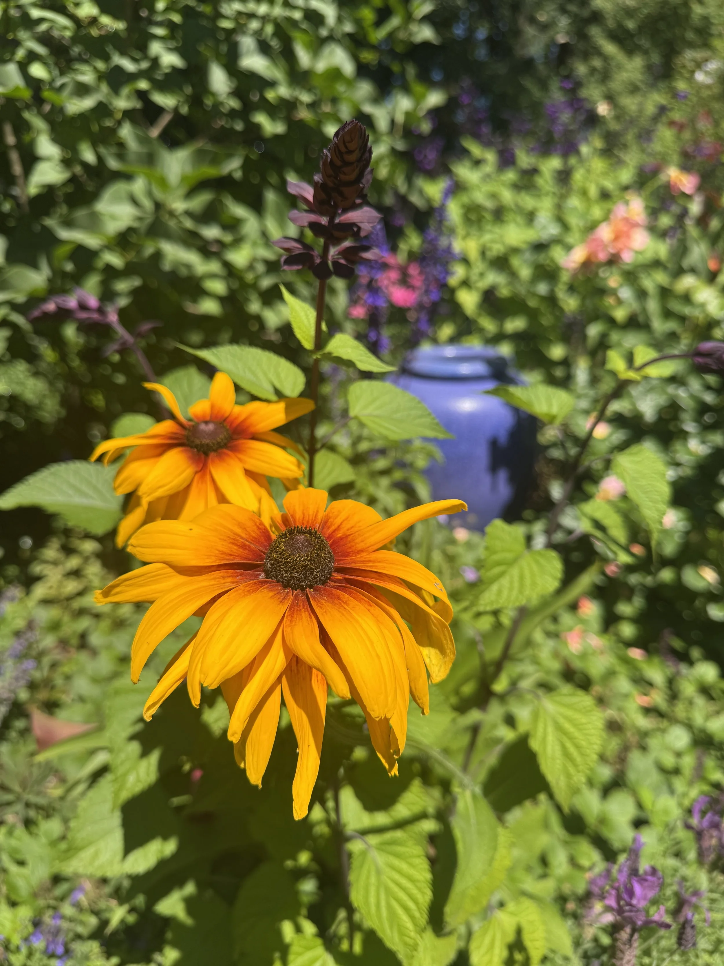
Then to just really blow it out of the water, my cottage garden consists of a series mini-gardens with completely different color schemes sitting side-by-side.
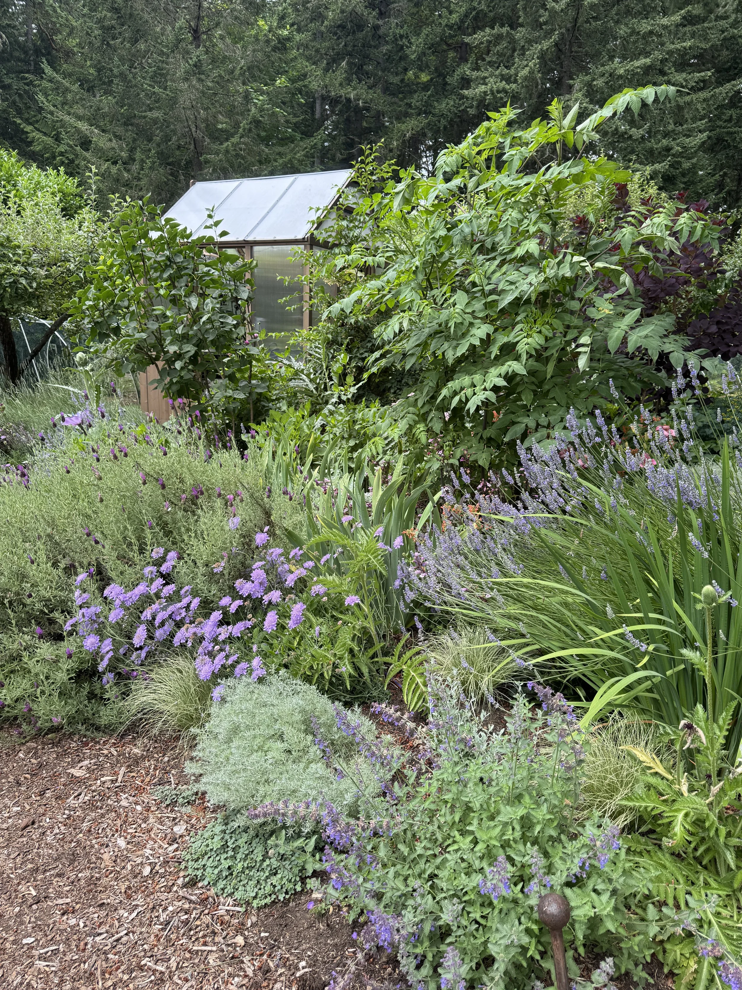
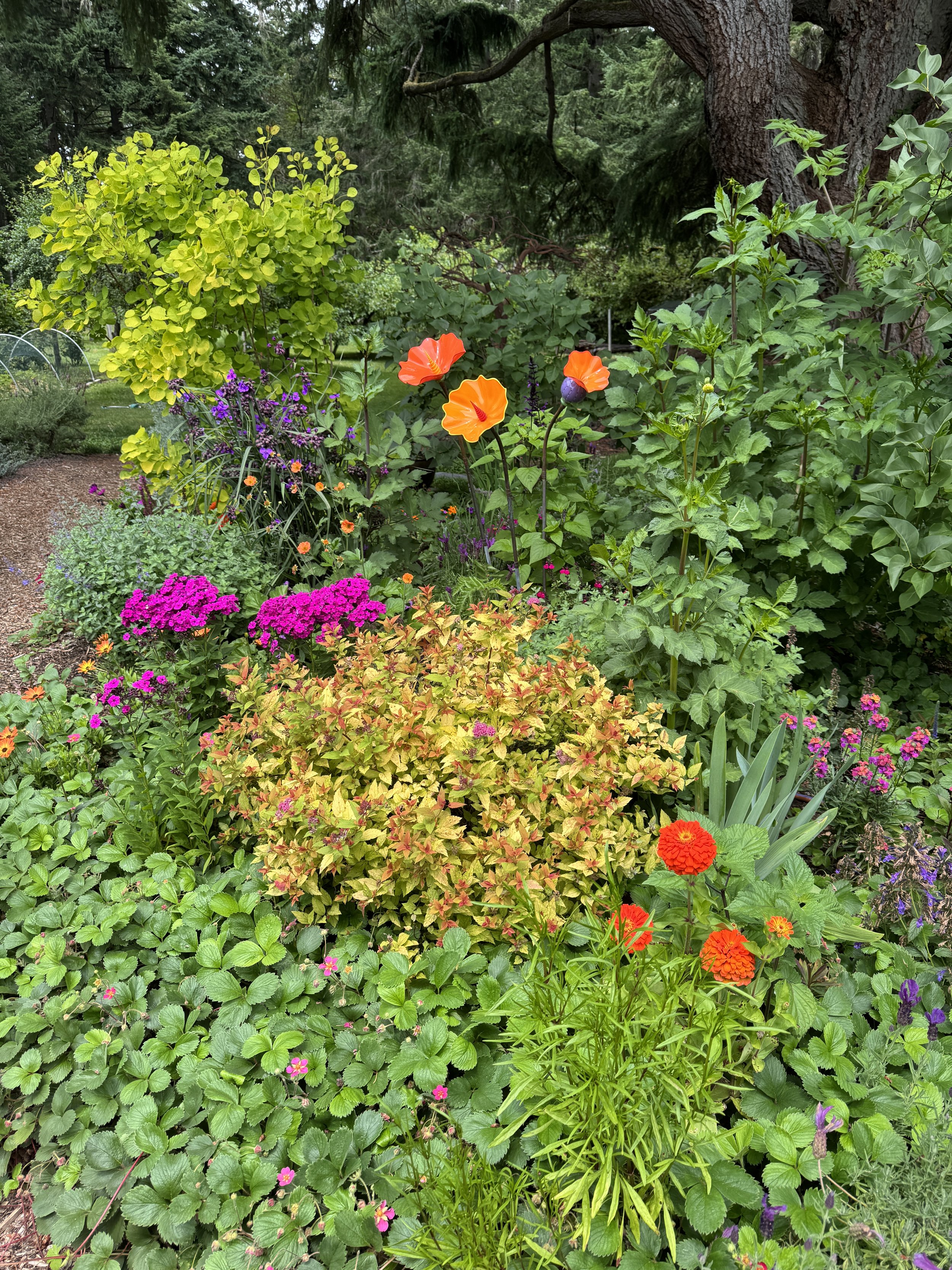
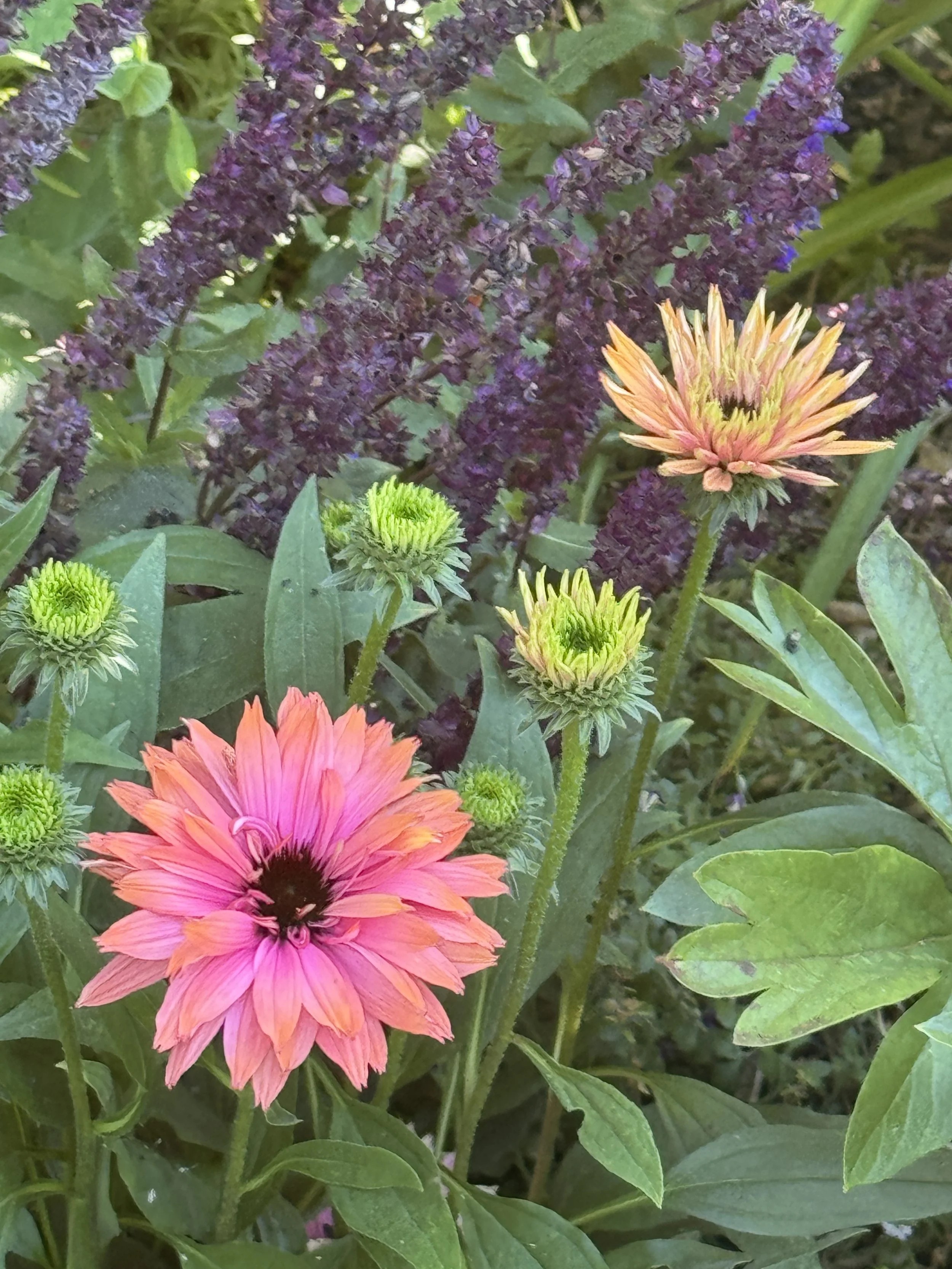
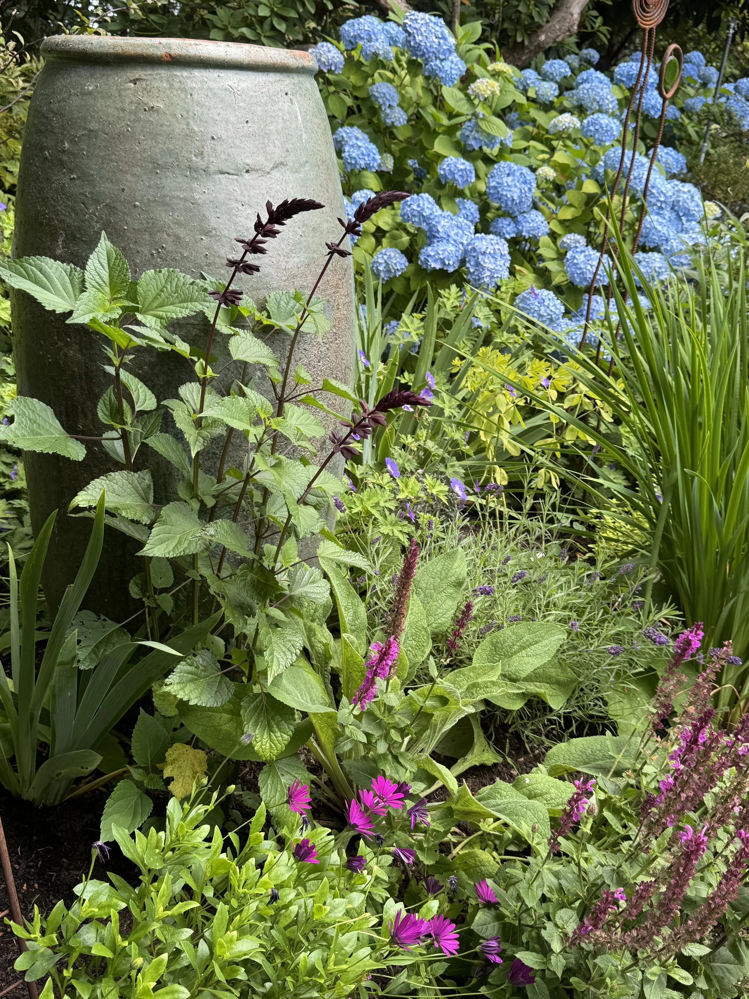
Everything I’m doing with color in my garden goes against the rules of garden design.
Either people will like my colors. Or think I am completely nuts.
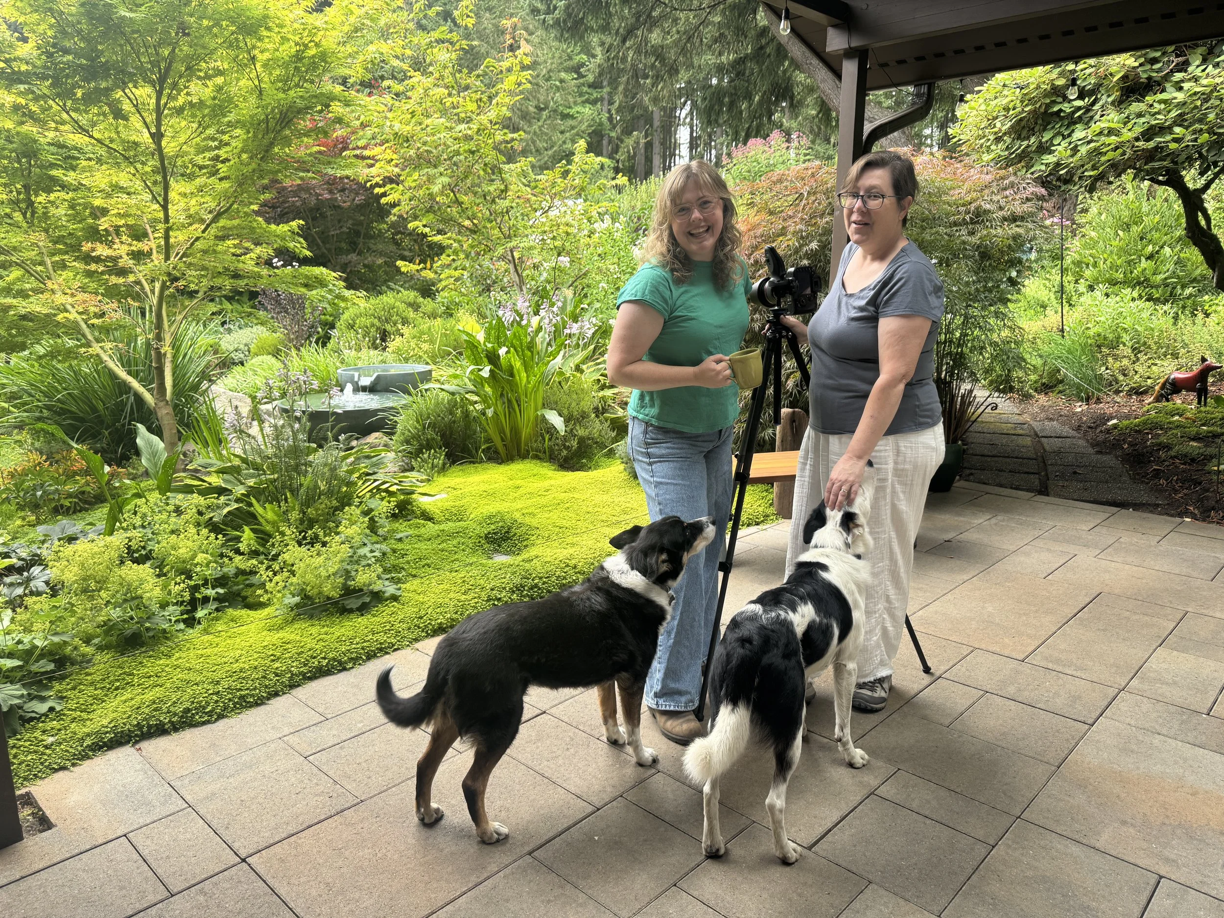
Our dogs greet Kate David - award winning garden designer + YouTube Star of #HelloGarden and Grace Hensley - Garden and Landscape Photographer of #FashionPlants
Turns out — they liked it!
Come take a tour of our garden — full of Colorful tips and tricks plus lots of stories and… a very exciting reveal at the end!
Here are what some folks are saying about the video:
“This is the coolest garden ever! I didn't think I had time to watch this all in one sitting, but then I couldn't stop.”
“Ok...not done watching yet, but mind blown, brain short circuited and overwhelmed! But inspired. Soooo many ideas in running through my mind right now. WOW”
“I don't remember enjoying a video this much on all of YT. [Beverly] is amazing, she has created such a wonderful piece of art out of her property. It must be an amazing feeling to see all this live. Heaven for the eyes.Thanks Kate and Brian for the tour, I would give this video 1000 likes."