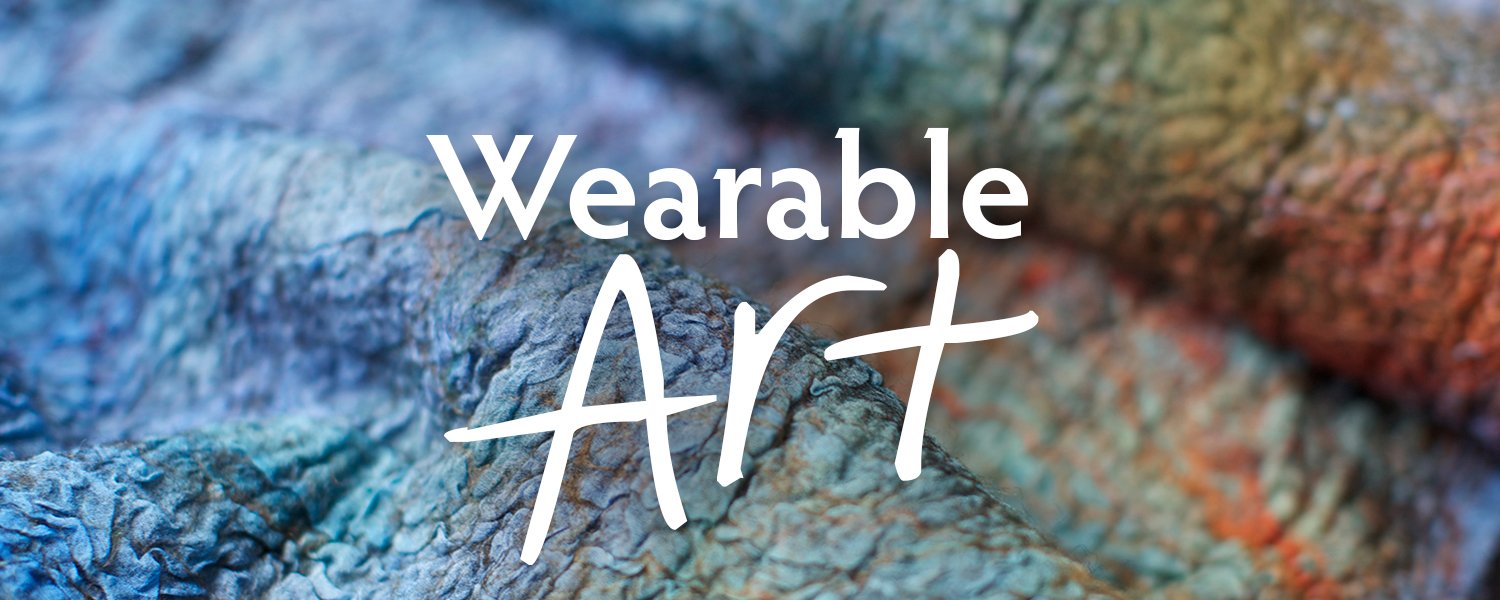
Mastering Color – Using Value in Art to Create Depth and Movement
Using Value in Art
When people ask me about color, I could go on and on about why every color is beautiful, how to create stunning color palettes with every single color, how to see the undertones in deeply unsaturated colors… (well, I actually DO go on and on🤣.)
But really, I should start the conversation by talking about Value.
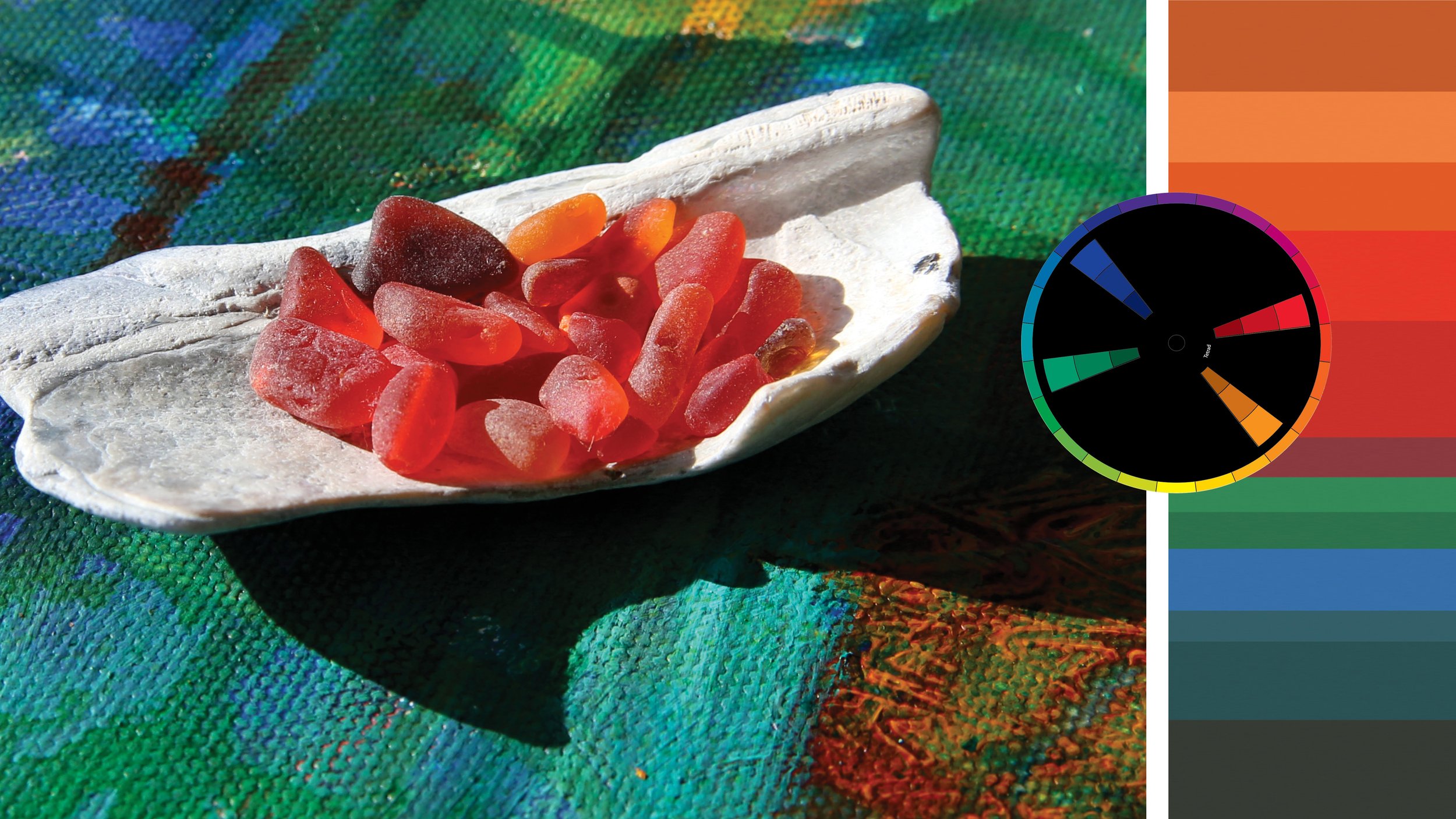
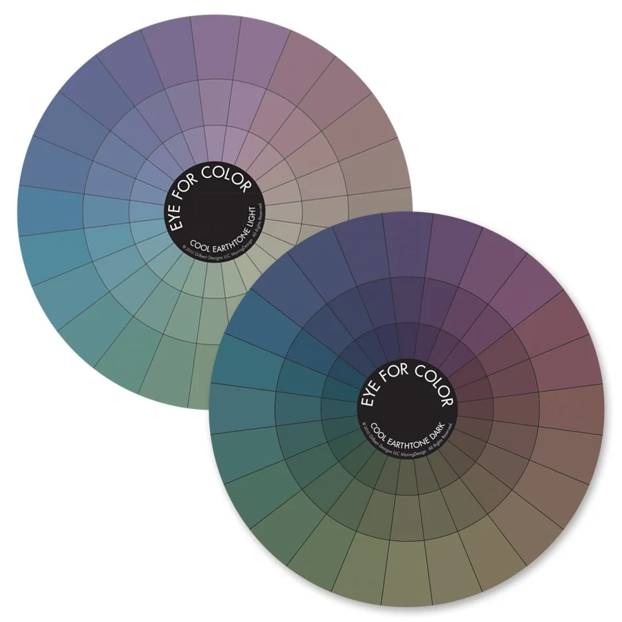
Because Value is probably the single most important design element I consider while creating a color composition. The deep shadows, the bright highlights are what breathe life and energy into every color palette. Not just the black and white ones we focused on during our Photo Tour.
When I feel like a composition just isn’t coming together, the first question I ask myself (yes, even before ‘What other color can I add?’) is:
“How can I push Value?”
How can I make the shadows darker and the highlights stand out?
As crazy as it sounds, I find it takes a bit of courage to bump up the value and really make the darks even darker and the lights even lighter in my artwork. I find myself wondering if that glow of light on her dress should really be that bright? Or if I should really add that much dark fiber to the scarf?
But each time I go for it and bump up the value, I’m always so much happier with the composition.
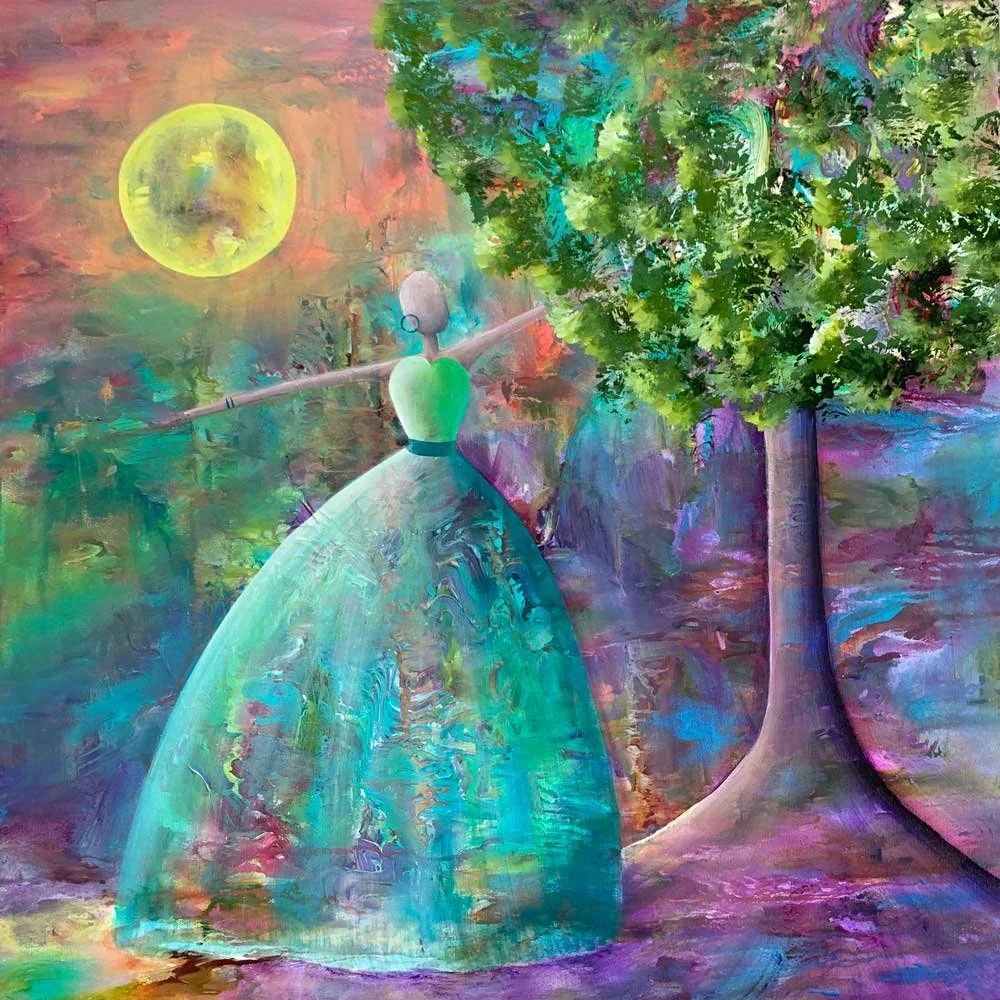
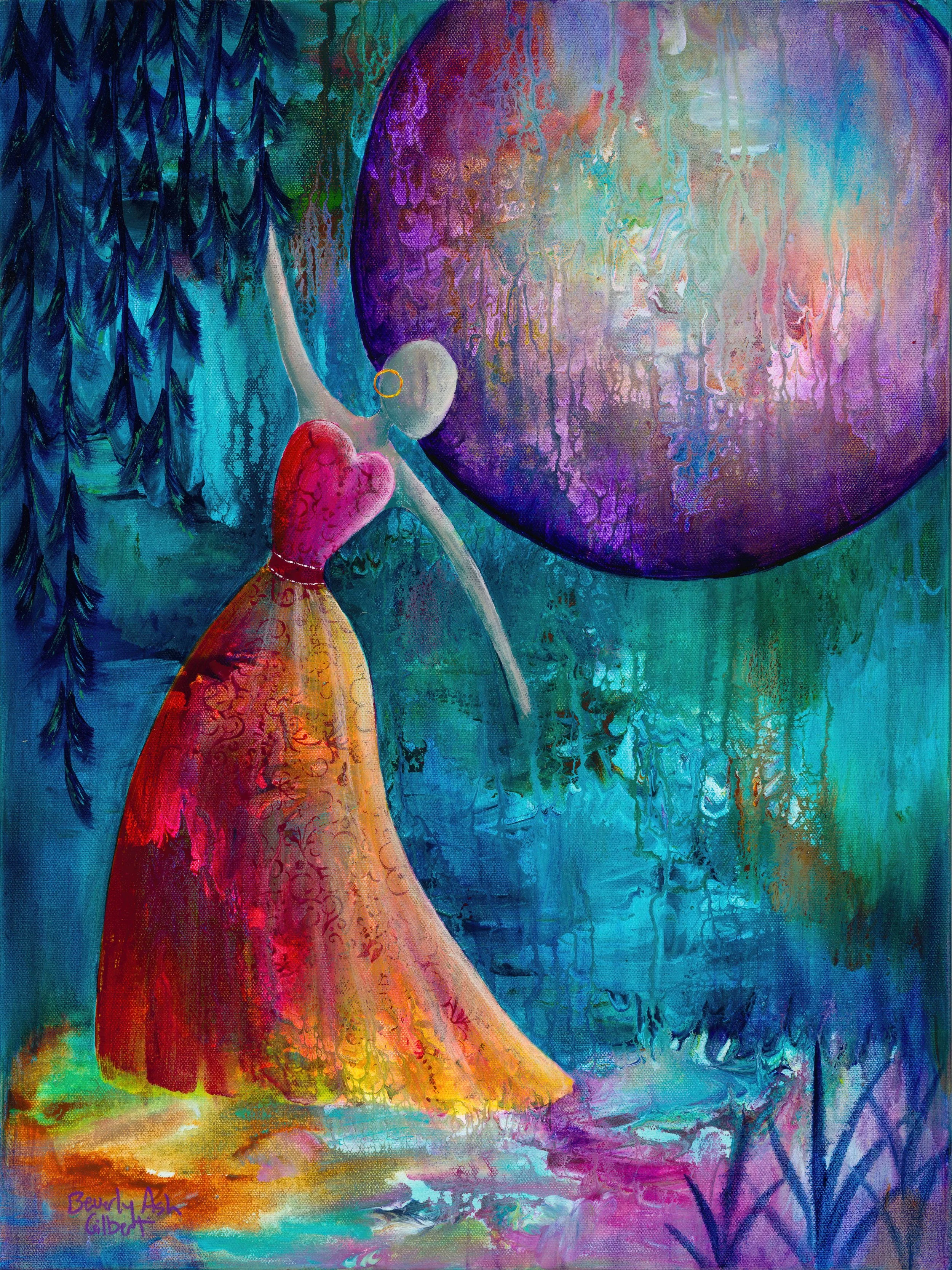
Dramatic value differences guide the viewer on a visual path through a composition
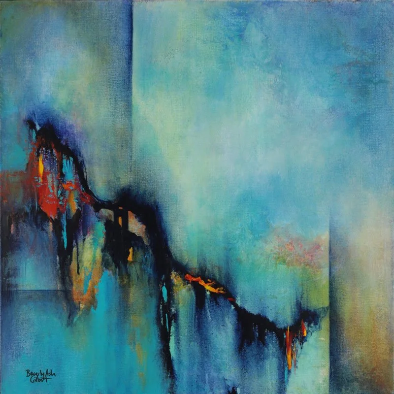
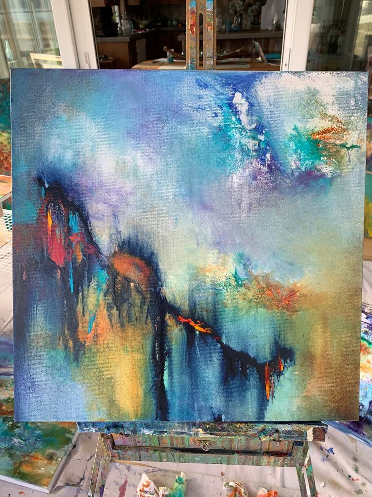
‘Birds On A Wire’ 20”H x 20”W Acrylic on Canvas
While painting: ‘Birds On A Wire’, I was happy with my initial swoop of ‘wire’ — definitely my eye leapt to the dark abstract birds against the pale blue sky. So I bumped up the value differences: lightening the sky behind the birds and darkening the top right corner to direct the eye back into the center.
However, when I stepped back, I noticed that my eye swooped with the wire… then fell off the bottom right corner of the page (first photo below).
By adding a few simple lines, I aimed to direct the eye away from the bottom edge and back into the middle of my painting. In the progression below, you’ll notice that I bumped up shading along the lines to emphasize the geometric feel and voila! My eye was pulled back into the middle of the painting.
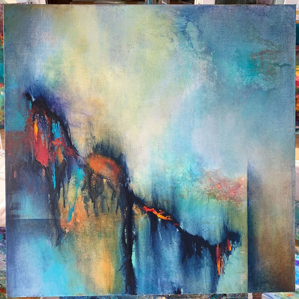
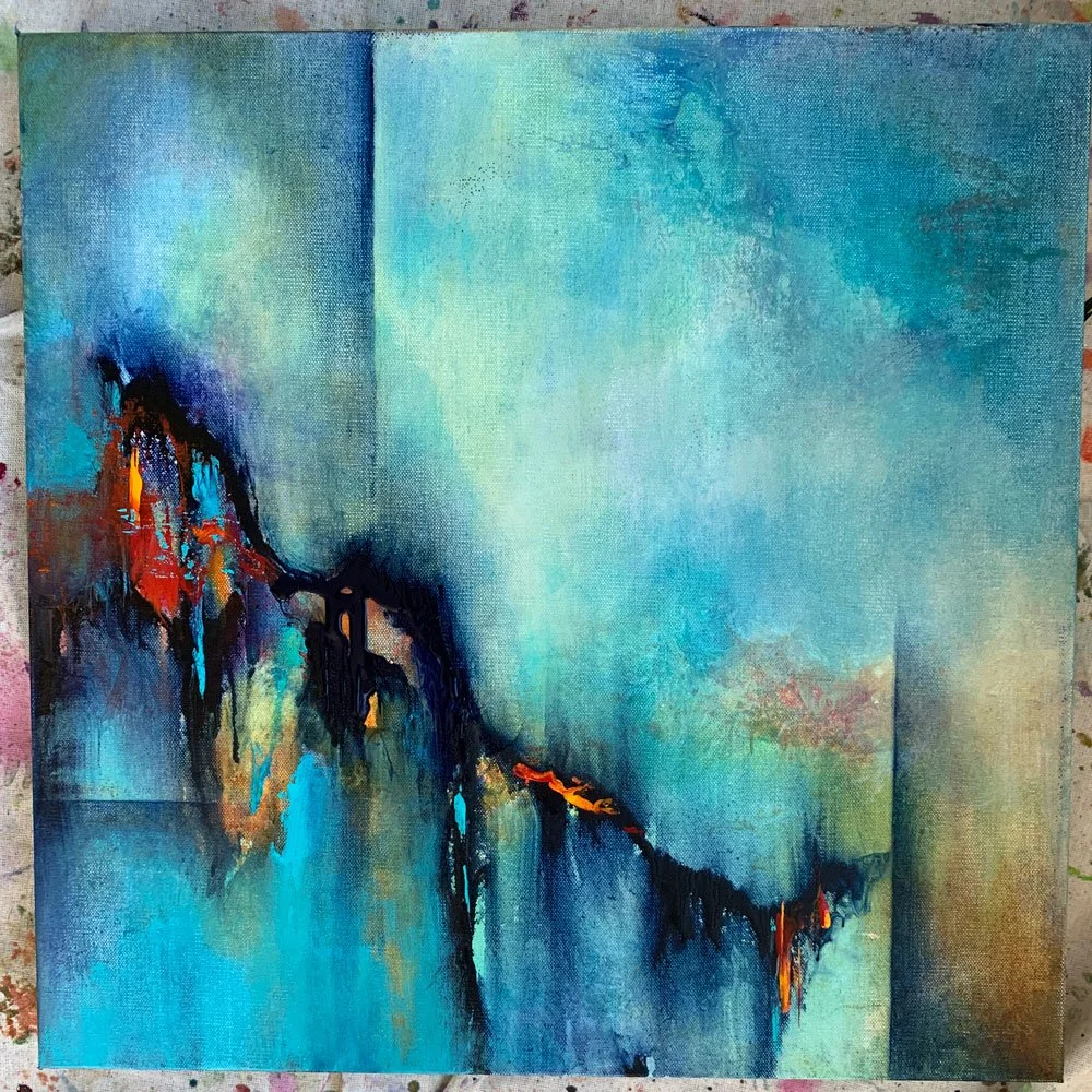
I use dramatic value differences, not just to draw out the objects in my paintings, but to also guide the eye on an interesting path—the goal of course, to provide depth, and interest while keeping the viewers eye in the middle of my composition.
Texture and movement doesn’t have to be dramatic, of course. The value differences can be more subtle, especially when the color palette is more restrained.
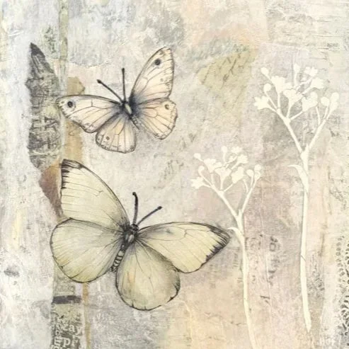
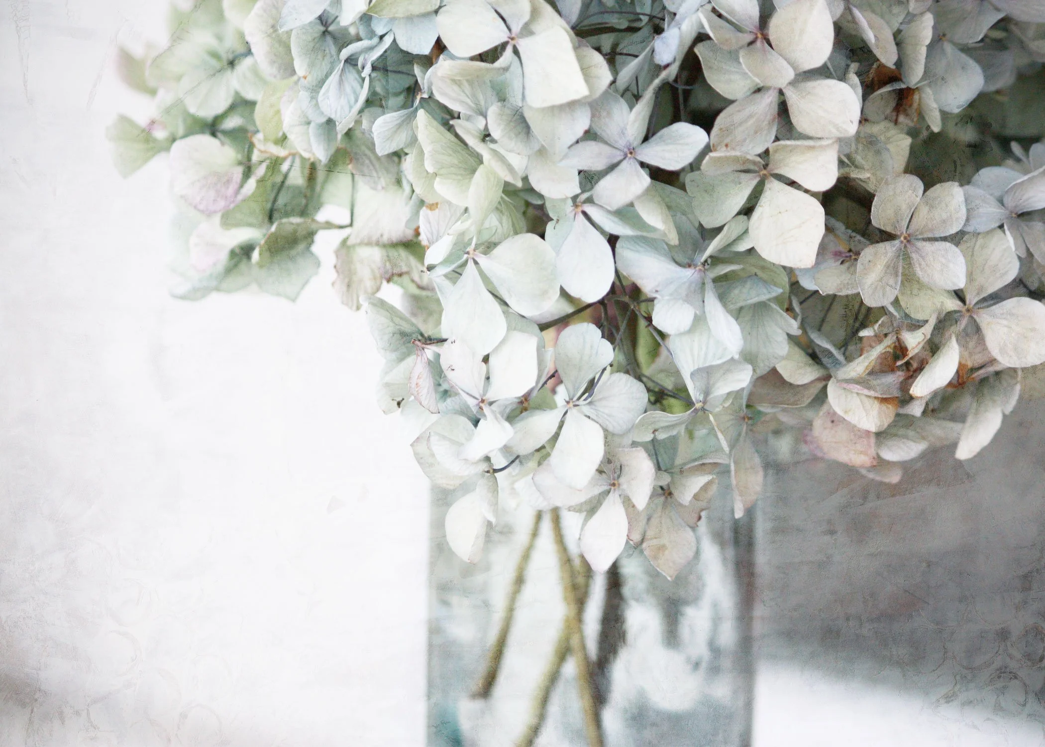
White doesn’t need to be boring
And yes, even though I’m typically drawn to deep, rich colors, I’ve also had fun playing with the softness of white, off-white, silver, beige and grey in a mix of mediums.
The key to create texture and movement—even when the color palette is muted—is to include a variety of value differences in your composition. These value differences don’t need to be as dramatic as black and white. They can also be subtle such as using beige with snowy white, or light and dark grey.
Take a peek at how I used Value differences in following muted palettes.
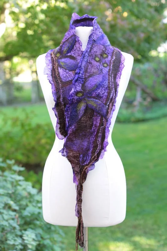
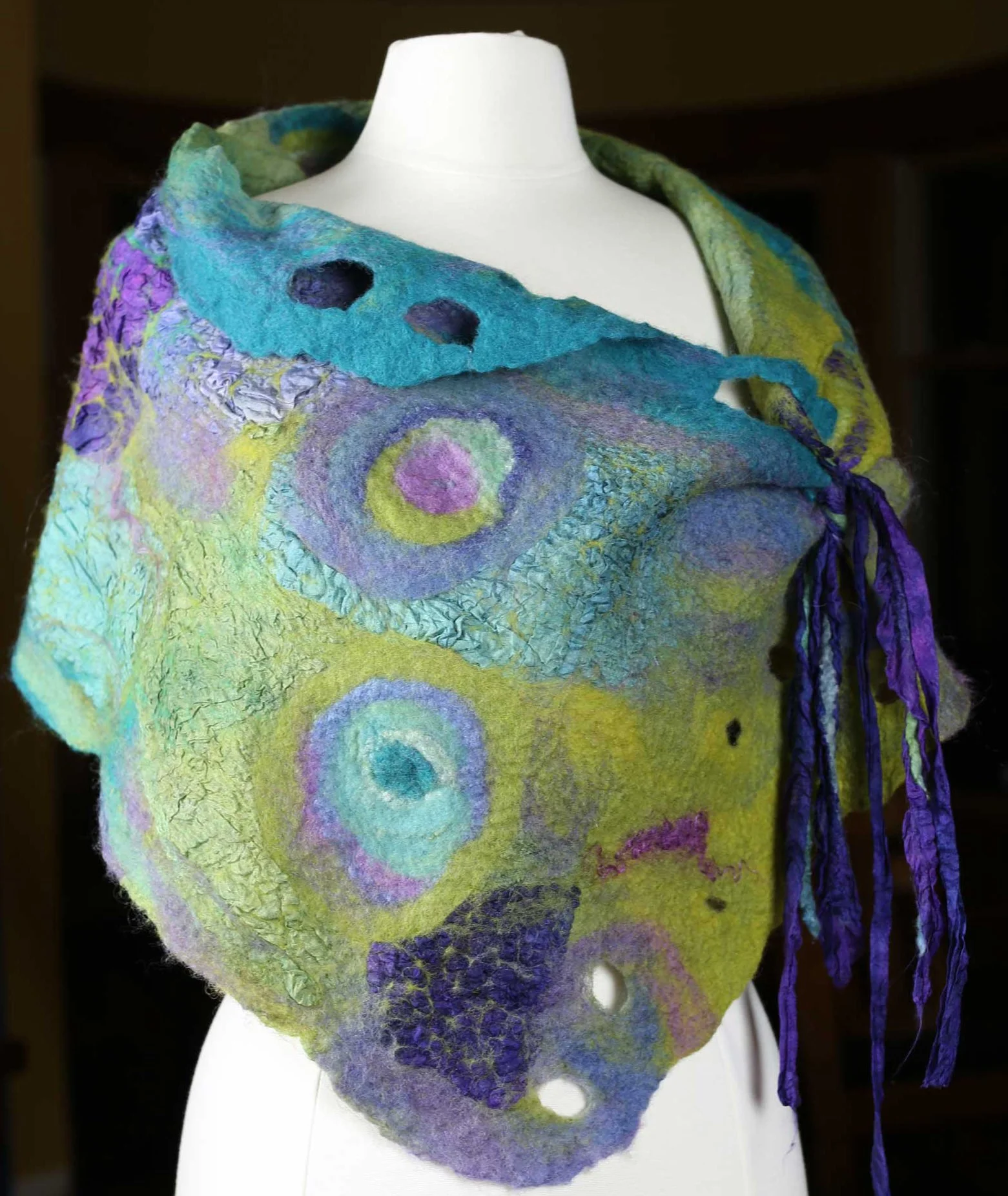
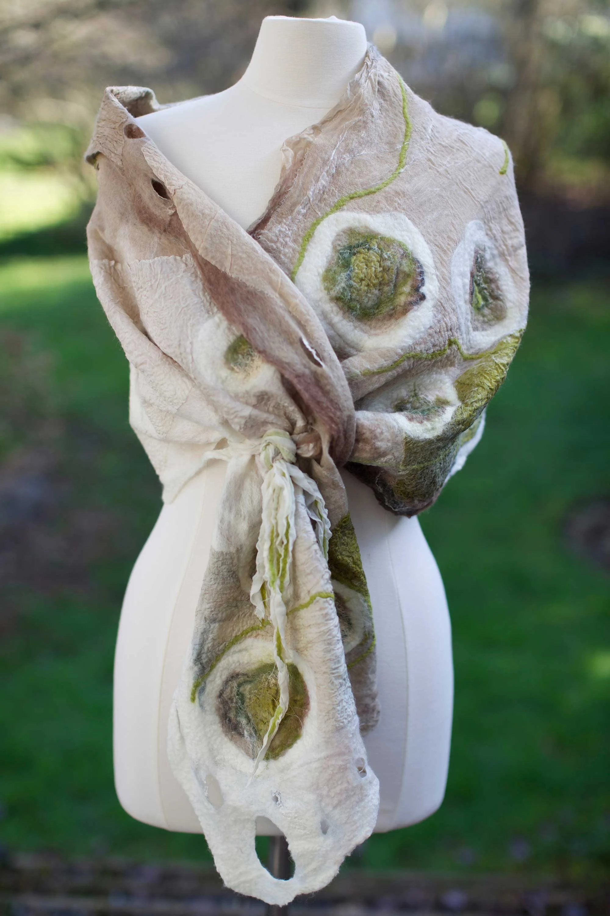
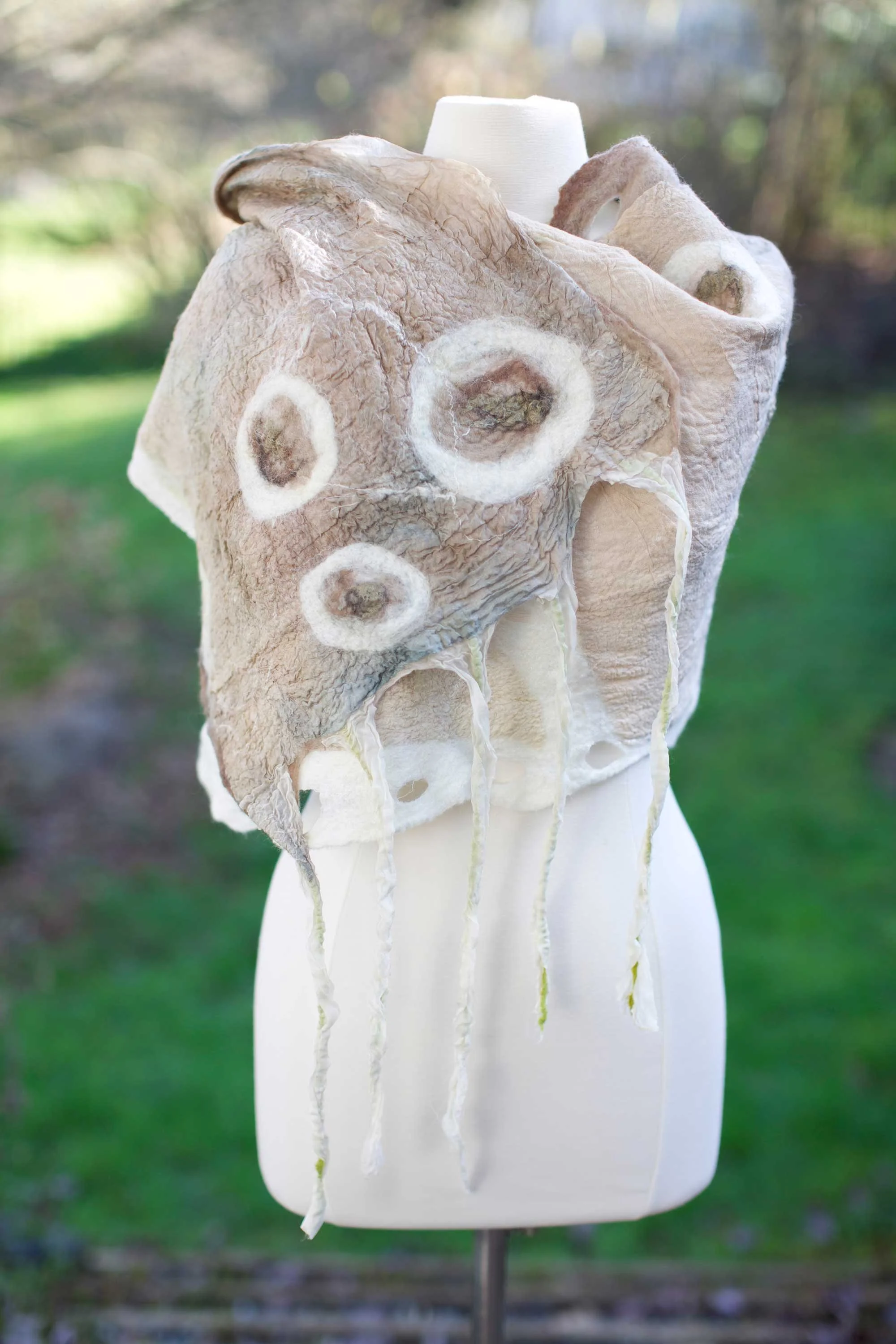
Nuno Felted Shawls:
White and beige make such a cozy pair, by adding just a touch of green on the left, and taupe on the right, there are a multitude of value differences to draw the eye to various places in the composition.
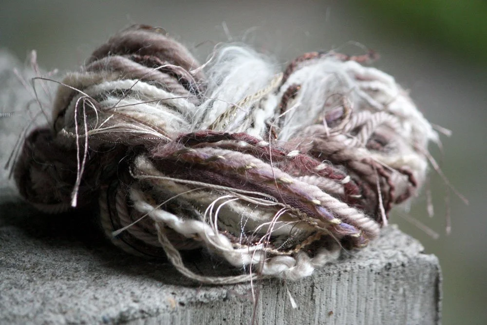
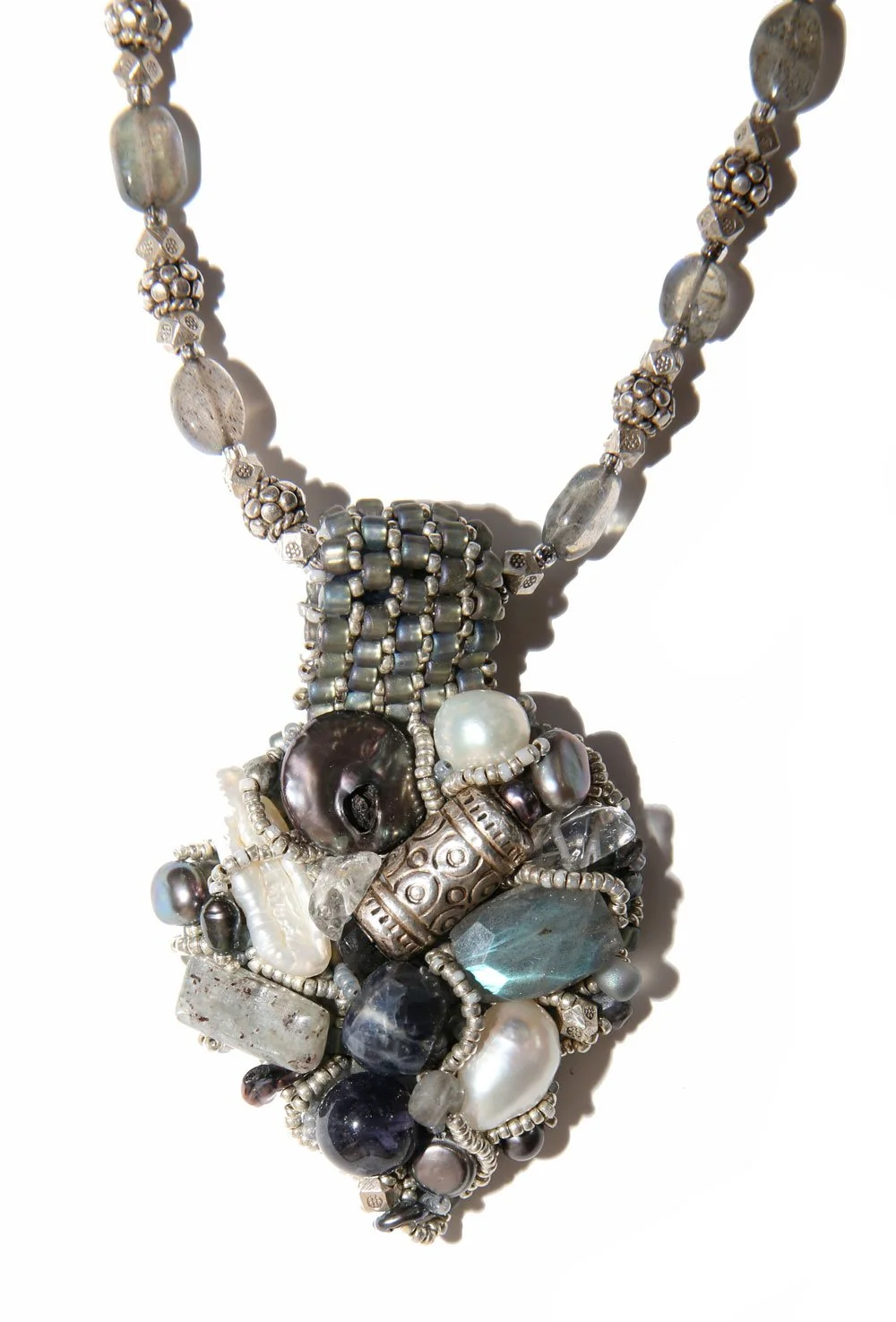
Fiber and Beads:
I’m a sucker for gathering wool and making bead soups — the mix being so much more exciting than each on it’s own. I make sure to add light lights and dark darks for luscious texture and movement.
Encrusted Pendant instructions HERE
Paintings:
I painted ‘Shades of Grey’ while teaching a workshop on color at my Whidbey Island Retreat. Notice how the simple horizontal black line grabs your eye because of it’s stark contrast against the lighter shades of grey and white.
Unfortunately, I found my eye to be stagnant… nothing was drawing me into other areas of the painting.
So, I added just a tiny bit of black in the top left corner, and a few broken lines in the bottom right. Now my eye moved from one area to the next.
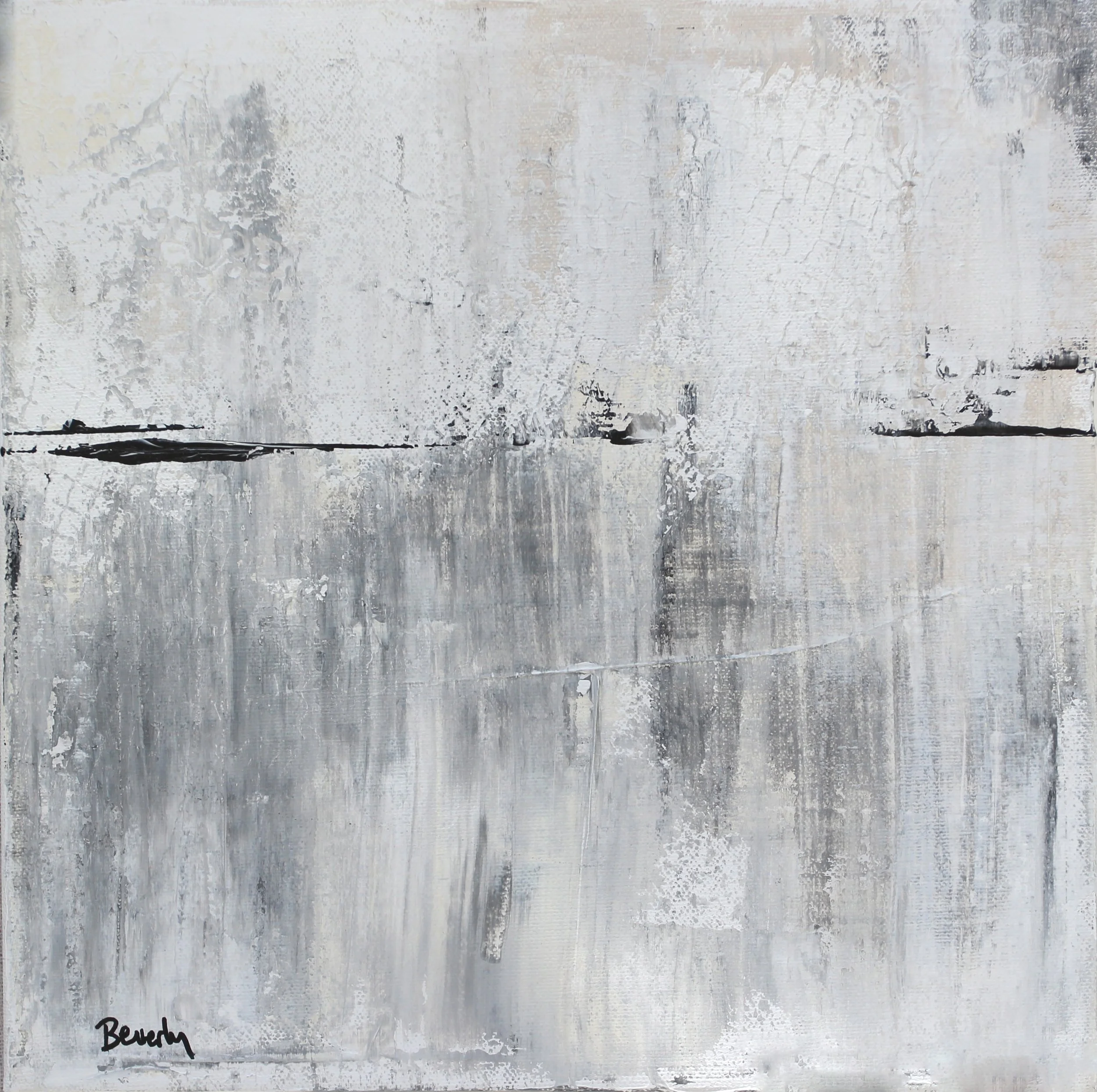
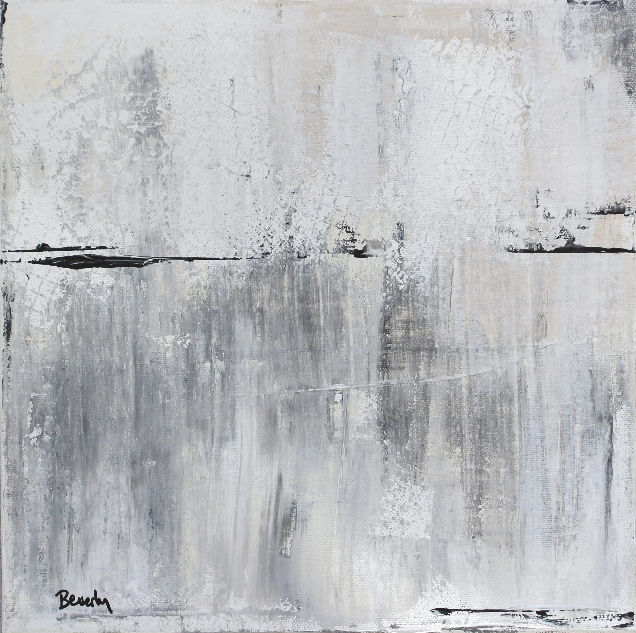
Remember: Dramatic value differences guide the viewer on a visual path through a composition
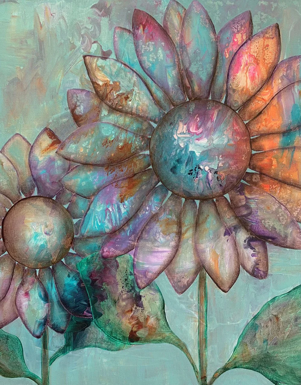
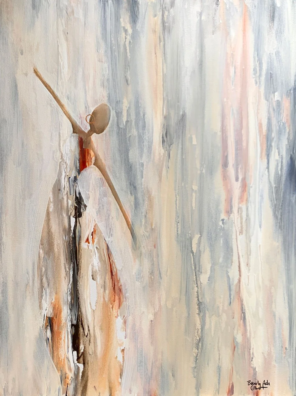
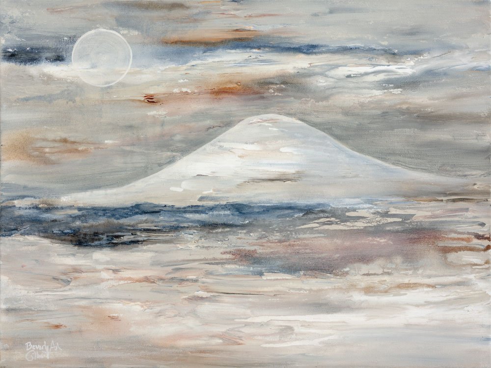
Some paintings in a neutral—but not boring—palette:
And Floral Design in soft shades:
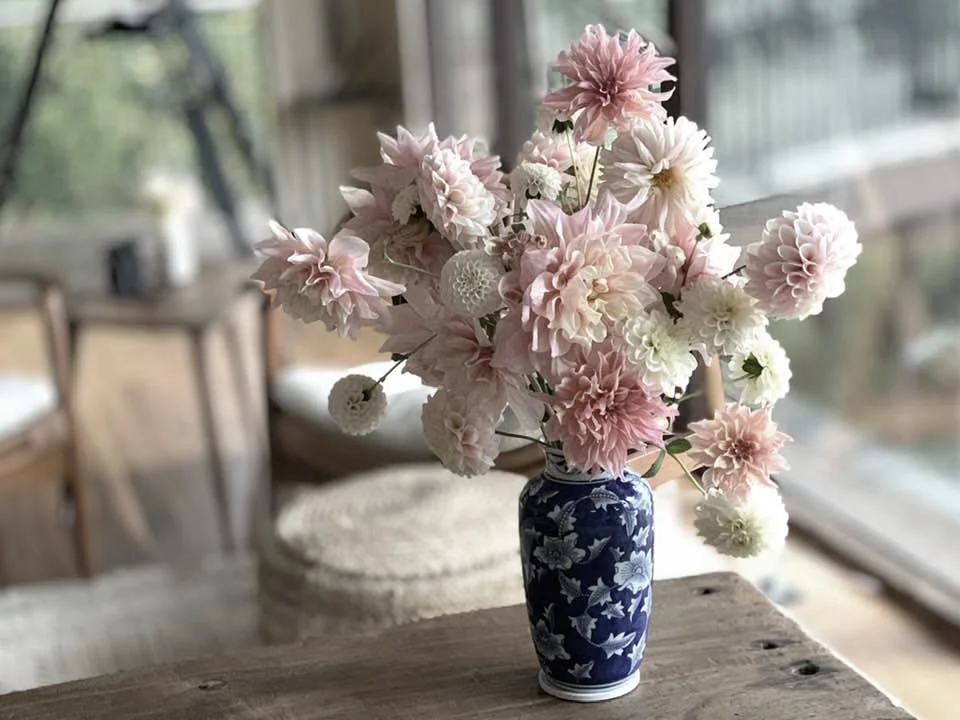
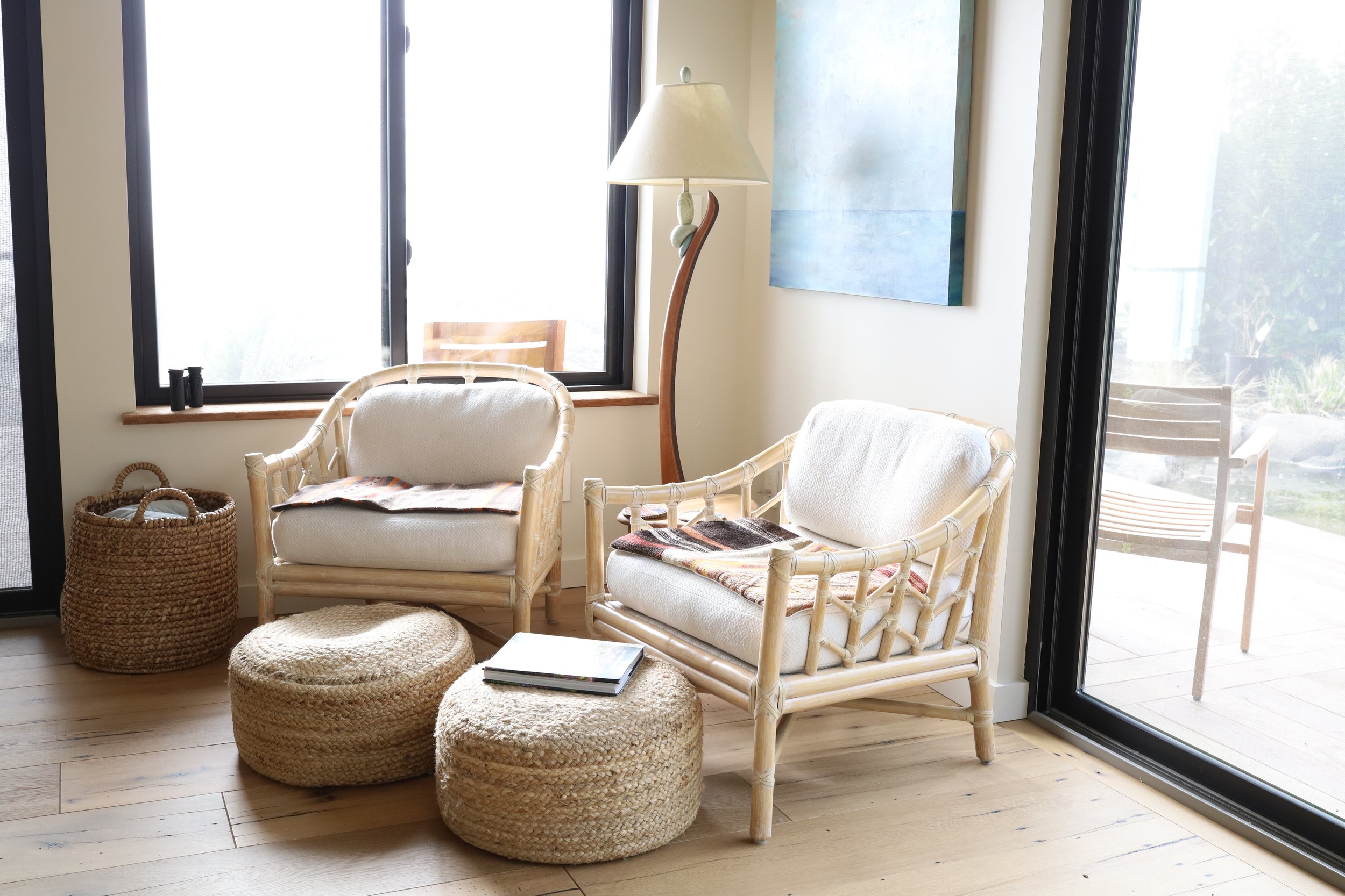
Of course, who can resist the allure of soft shades in home decor?
This is a corner of my new studio—a perfect neutral backdrop to showcase my vibrant paintings as they pass from my easel to my customers. My dear friend, who comes to stay with me for a month each year, just happens to be a master stylist who helped me pull together cozy vignettes full of natural reused and reclaimed materials, soft textures and layers of off-white, beige and soft brown.
I highly recommend reading Dagmar’s blog on the beauty of white.
No matter what color palette calls to your heart, don’t forget to use Value to create depth and movement in your composition.
Remember: the more you practice bumping up value, the more confident you’ll be in keeping Value at the top of your Color Tool Box.
Next time… let’s try some Value-able exercises!


Read more about Mastering Color: