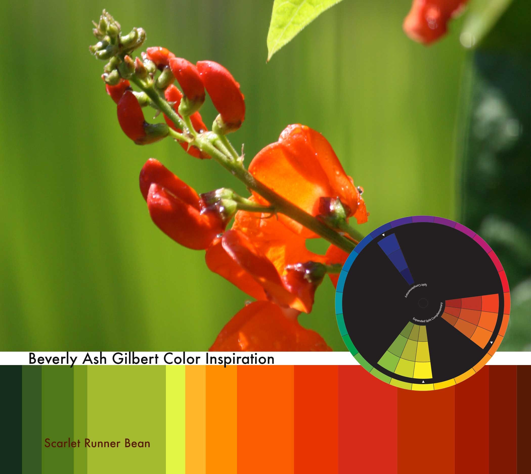
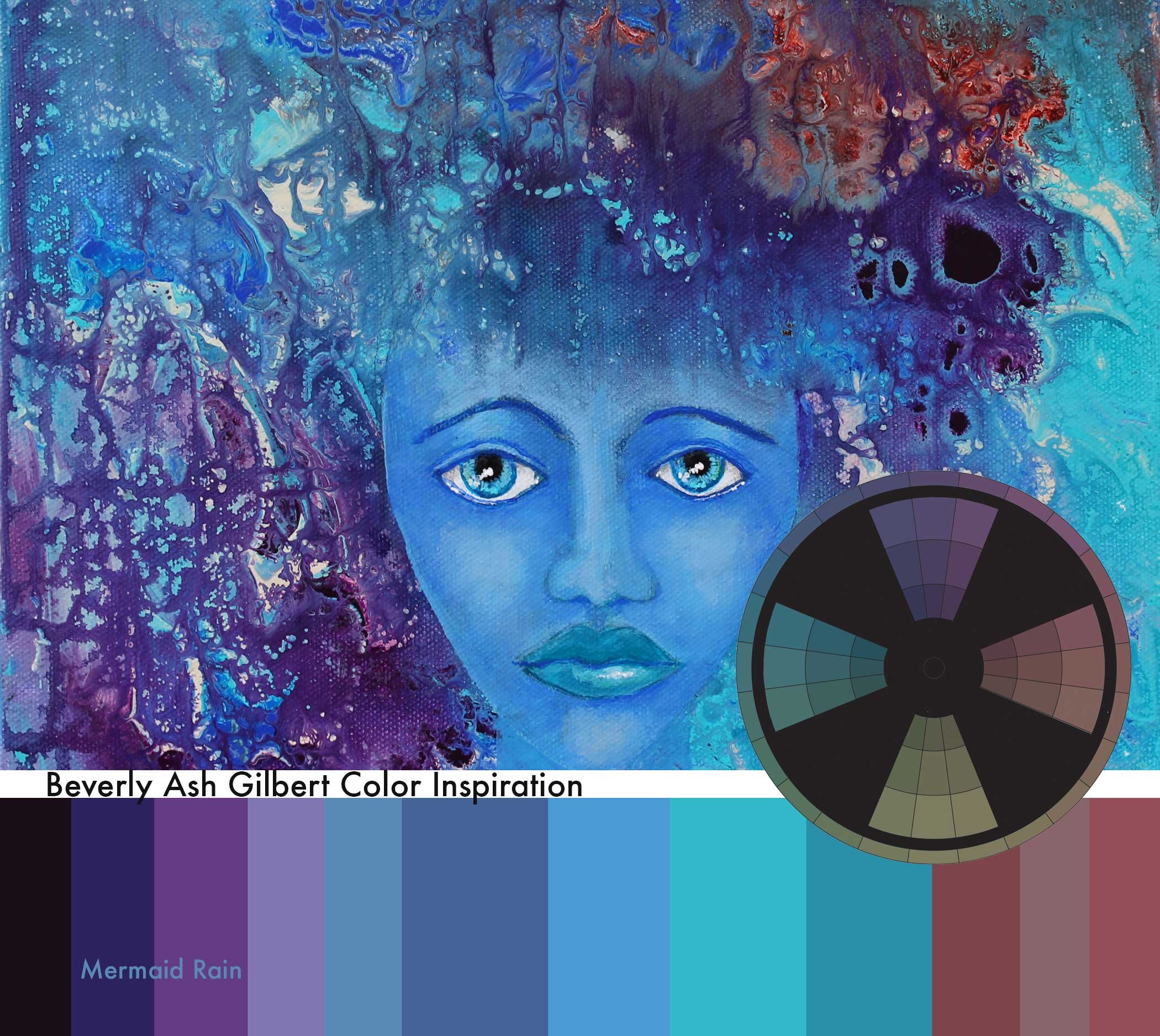
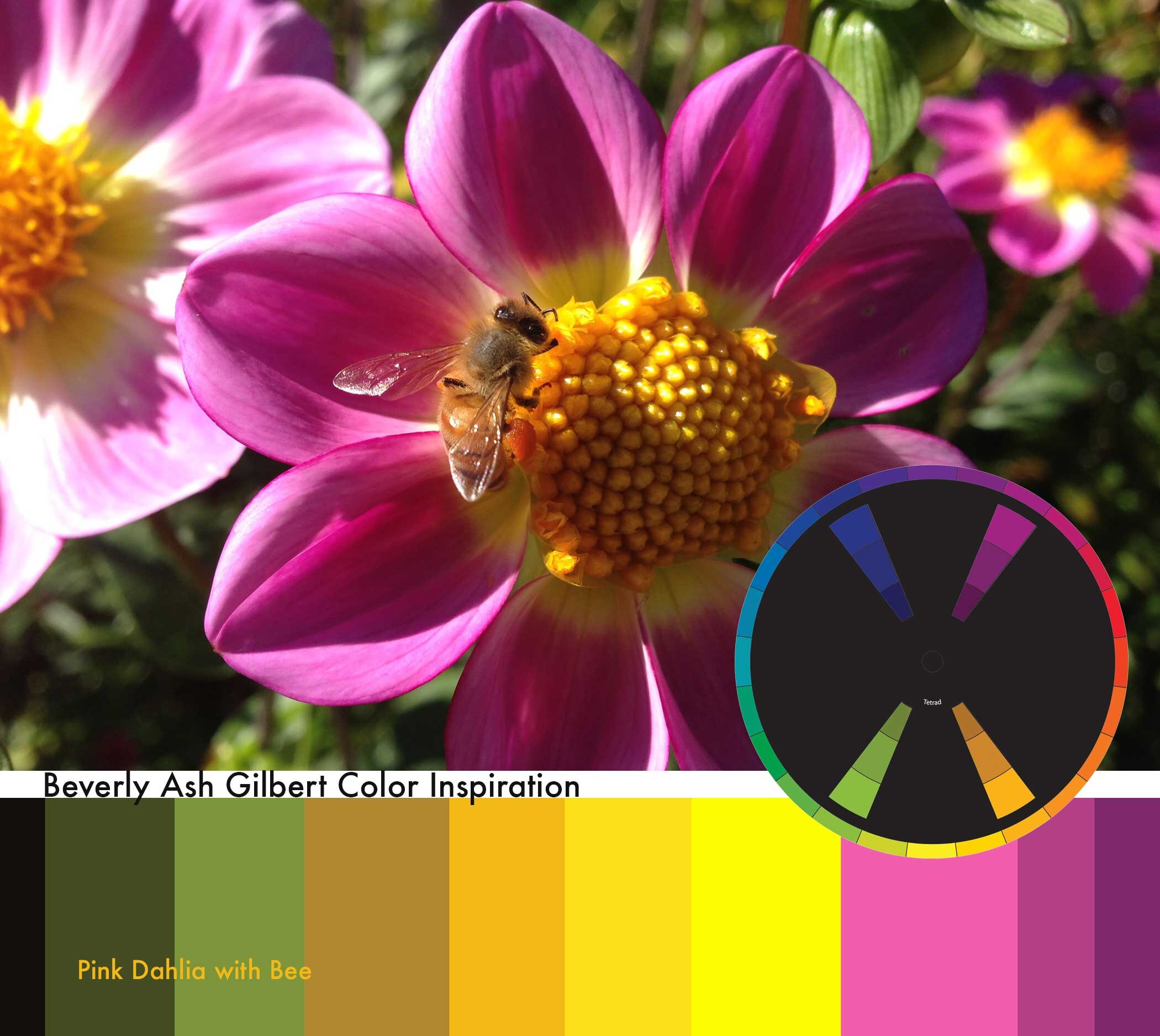
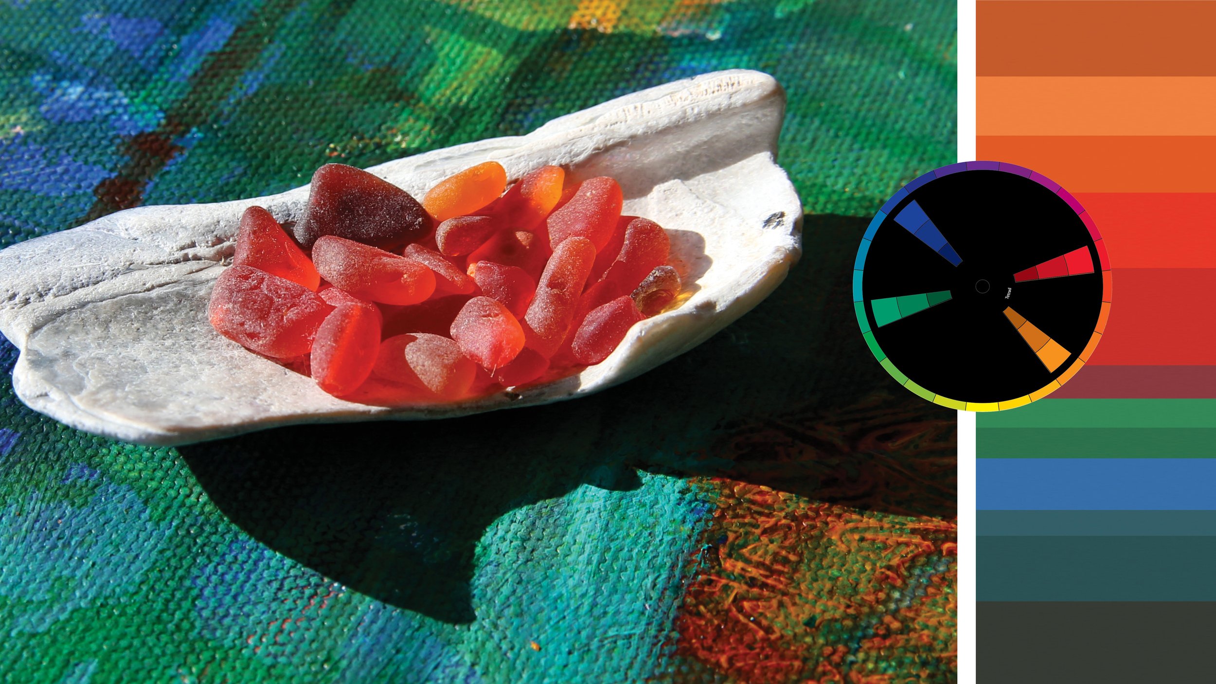
Some saturated palettes for you to play around with
Saturated Color on a Hot Day
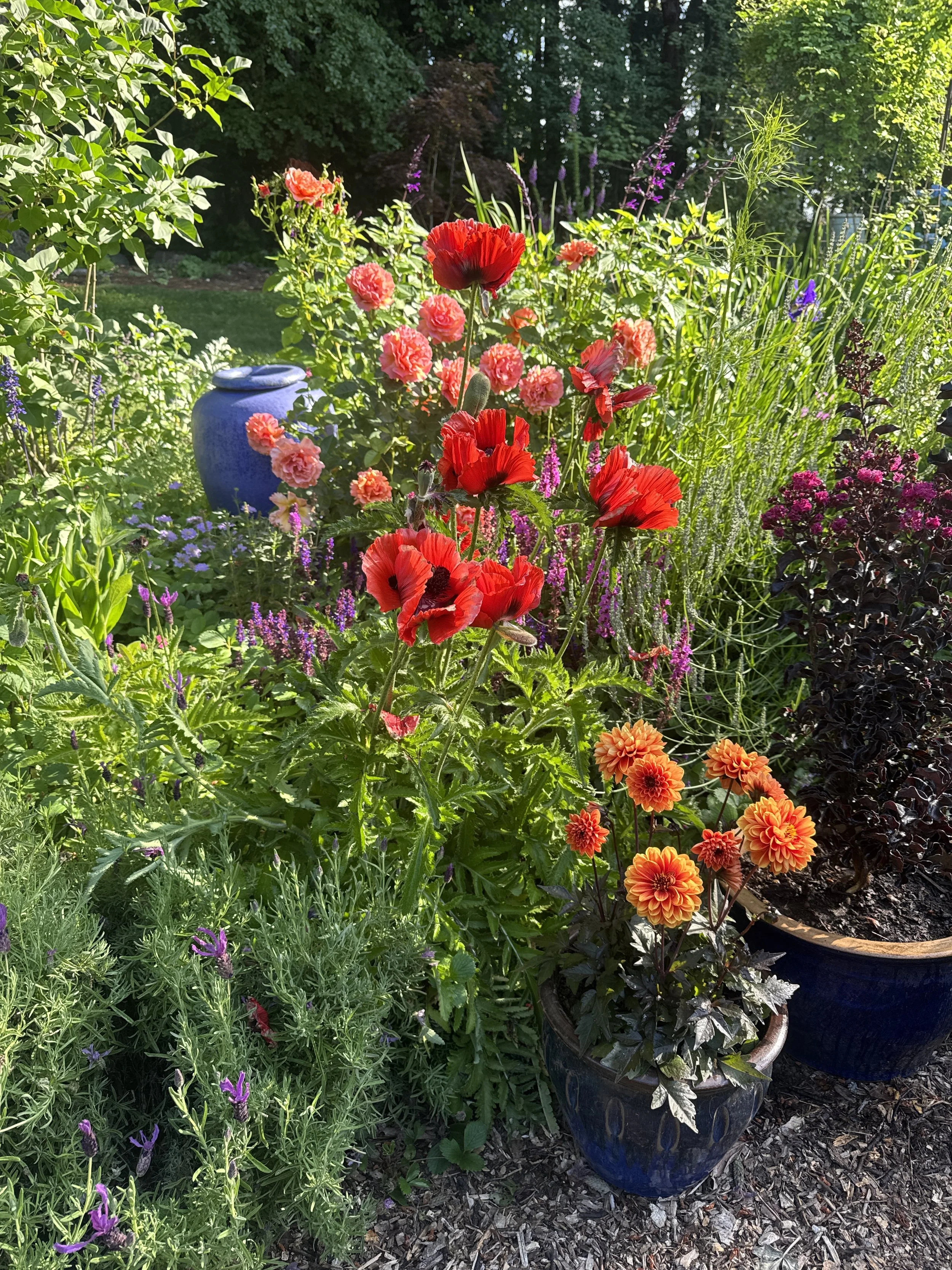
We've just been through a stretch of really hot weather in the Puget Sound so... I thought some lush, bright color inspiration might be just what the color doctor ordered!
Behind the lens
I could happily spend hours behind the lens of my camera grabbing colorful vignettes and possible color inspiration for future projects.
Speaking of saturated
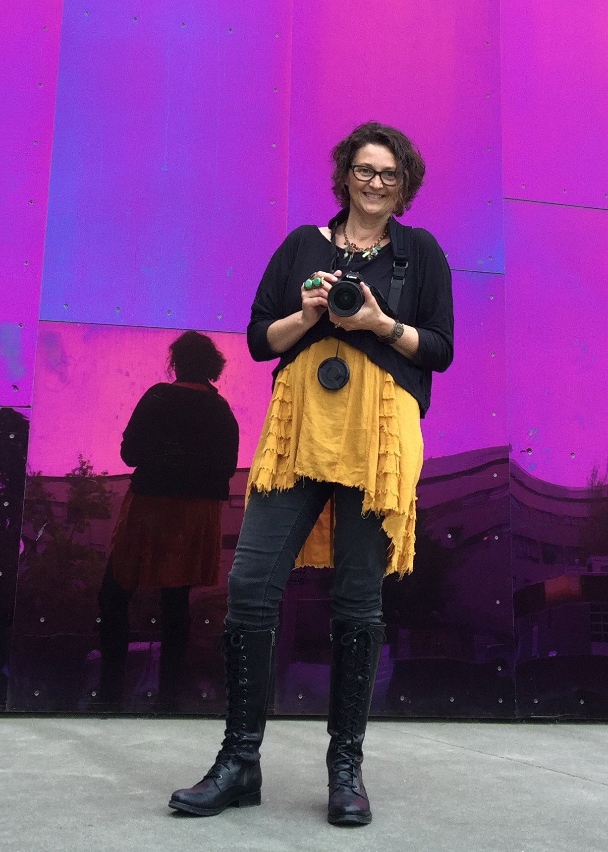
Me in front of the amazing oxidized metal wall at Seattle Experience Music Project
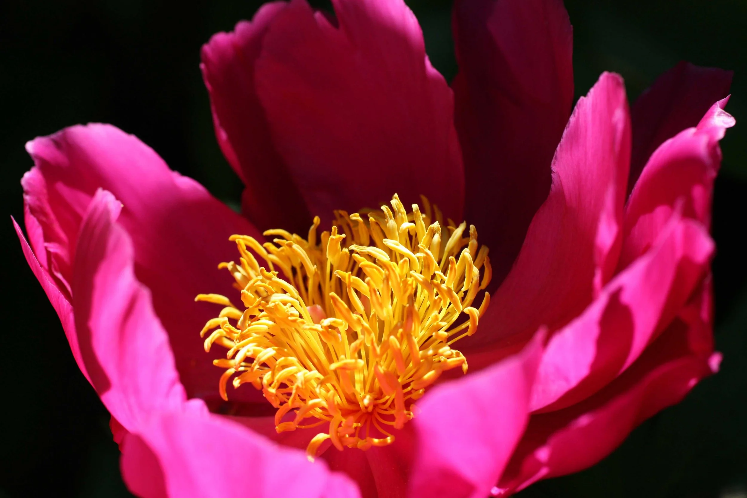
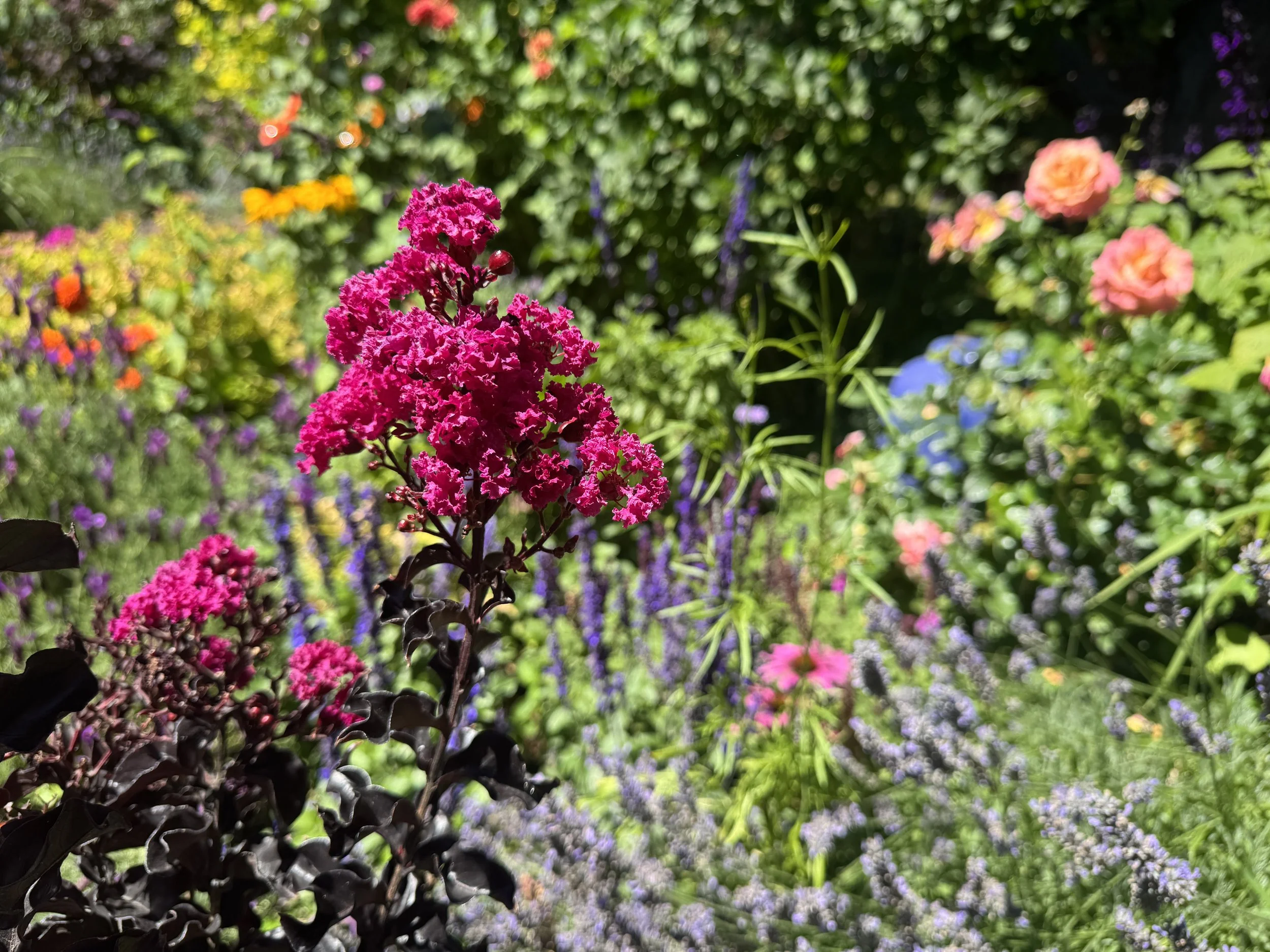
A fabulous peony in my neighbor’s garden
A hot color palette
Pink and Yellow form two parts of a tetrad on the saturated color wheel. Though the peony doesn’t have any green or purple in it, these color families fill out the color harmony. What a fabulous hot, bold color palette to work with!
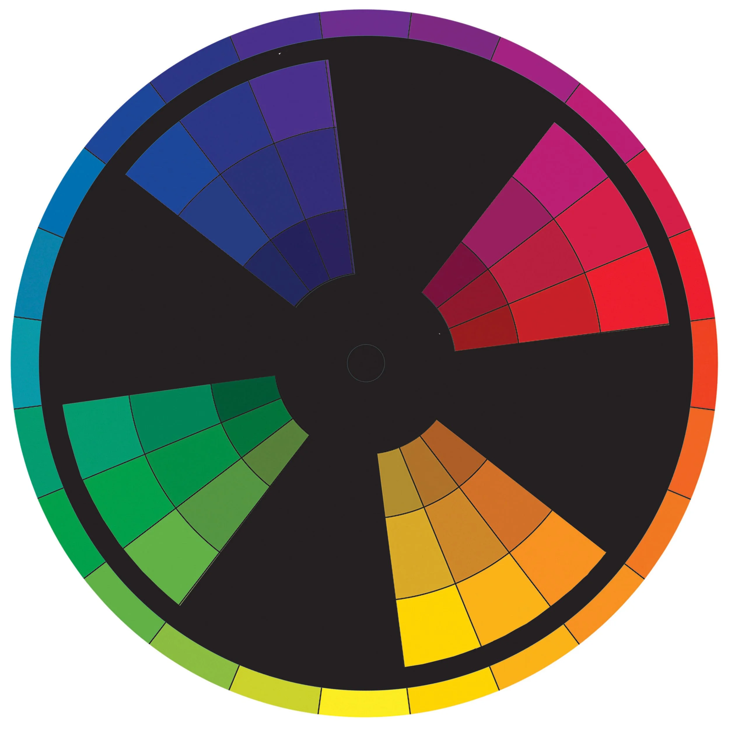
Want more color palettes? Dive into my book: Artful Color for Creative Project to be colorfully inspired!

Read more about Using Color
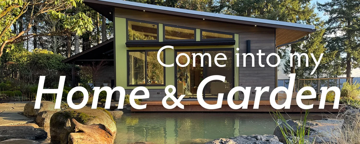
I don’t play by the rules when it comes to using color in my garden. Turns out they love it - come on a tour with award-winning garden designer and youtube star Kate David of Hello Garden Design
When we agreed to open our garden for over 2000 visitors, we had no idea what we were signing up for. Luckily my wise son taught me a very valuable lesson…
If your Creative Group would like to hear my presentation on Color—and how I weave it into my Nuno Felt, and paintings, and bead work, and garden—then click the button below and Let’s Talk Color!
The more you practice bumping up value, the more confident you’ll be in keeping Value at the top of your Color Tool Box. Let’s try some fun exercises
Value is probably the single most important design element I consider while creating a color composition. The deep shadows, the bright highlights are what breath life and energy into every color palette and direct the viewers eye through the composition.
When we are surrounded by the colors we love, we feel energized, uplifted and joyful! And the beauty is —the colors that bring you joy are unique to you!