A Value-able practice - Create more Value in your artwork
Let’s play with Value
…continued from Using Value in Art to Create Depth and Movement
The more you practice bumping up value, the more confident you’ll be in keeping Value at the top of your Color Tool Box. And what better way to train your eye into seeing value, than by taking the color out.
So to walk my walk, I thought I’d dust off a journal and do something you don’t normally see me do… I took the color way, way back and just focused on light and dark.
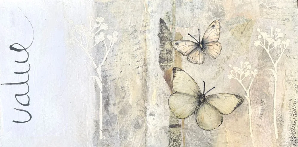
Value Journal Pages: A very simple journal spread focusing on subtle shades of off-white
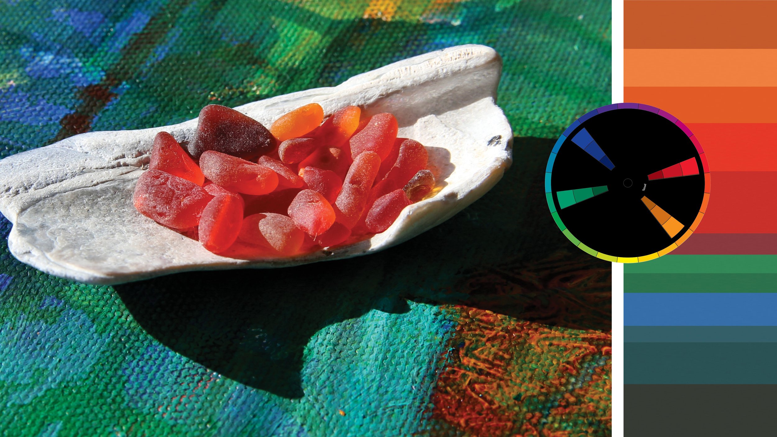
Of course ‘dark’ and ‘light’ are relative. In the Value study above, I used a wide range of values from very light cream to charcoal black.
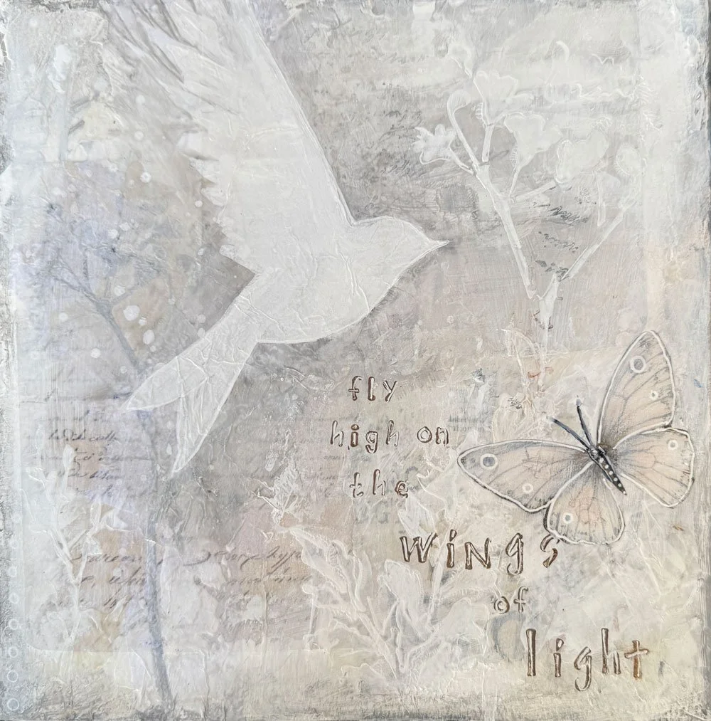
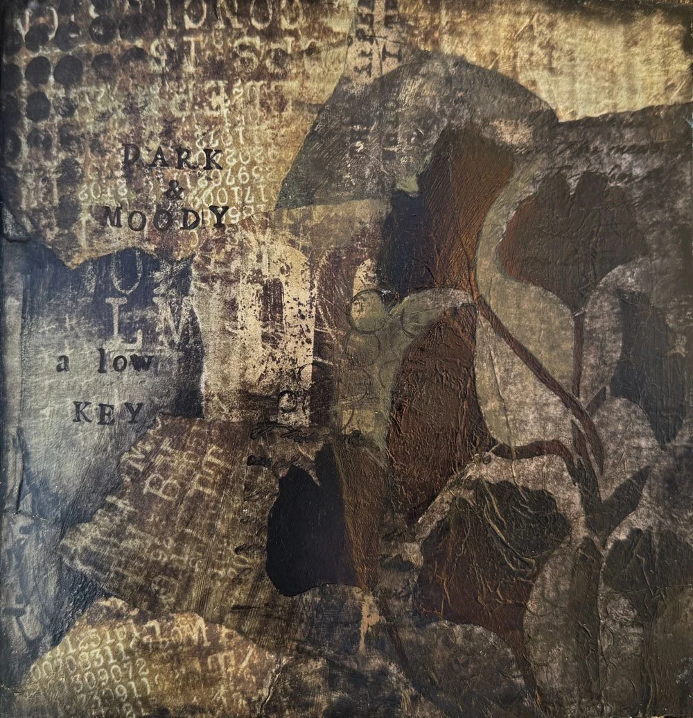
Below I narrowed the range, focusing on a lighter touch for the first (this is called high key for us color-theory nerds) where the lights are white and the darks a light grey. And on the opposite page, a darker range (low key) with darker lights and deep dark black for the darkest shades.
A Value-able practice
My challenge to you is to create a journal page (or two or three!) using just shades of white, grey, black. Feel free to collage and paint in whatever style feels good.
By the way: A journal page is a fabulous no-pressure way to play. It’s only a piece of paper and you never have to show it to anyone!
Not sure where to start?
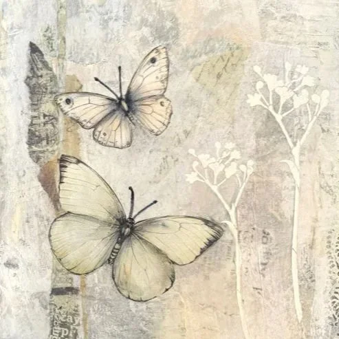
You can find some fabulous budget-friendly collage papers on Etsy that you can download and print - like the butterflies I used on my collage pages above. Simply tear or cut pieces and glue them onto your journal page with glue sticks or acrylic medium. You can add paint, pencil or pen on top if you’d like.
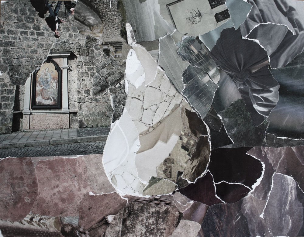
Try simply tearing out pieces of a magazine featuring shades of white and paste them onto a journal page willy-nilly with a glue stick, as I did in the first collage below with a very dramatic eye
Or arrange torn pieces of magazine into a recognizable shape such as a pear or heart or circle or…
Try loosely sticking to shades of white, grey and black - but totally OK to include de-saturated colors like I did in my collages - remember the main focus is on Value differences rather than color
(the supplies I used are at the bottom of this page)

Or perhaps you’d like to pick up a black or grey pen and start doodling. Using just black and white, I don’t have any shades of grey in the following Zentangle:
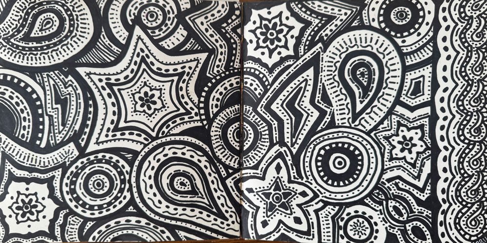
Zentangles are fun and easy!
Whatever you end up creating, take a look at your composition through the lens of value, by comparing all of the different shades of light and dark to the Grey Scale below:

Some questions to ask and notes to take:
How many shades did you use?
Did you tend to create with the full range of values?
Or was your composition in a High Key (mainly lights) or Low Key (mainly darks)?
Also, make a note of where your eye travels on your composition. Is there movement? Texture? Does your eye follow a pleasing path or do you find yourself feeling chaotic or bored?
Make sure not to judge your composition, simply take notes so that you can learn how to ask the right questions in future compositions.
Having fun? I hope you will join me for my upcoming class:
Supplies:
Value Journal Pages:
Water-color paper journal: Amazon
White Gesso: I coated each page to add heft and reduce water absorbancy
Downloadable collage papers, such as the Butterfly images from Bow Arts on Etsy
White paint pens: Artistro on Amazon
Titanium White, Titanium Buff and Bone Black acrylic paints (for the value collages, I used inexpensive student grade and mixed with water)
Letter stamps and ink pads: Amazon
Magazine Collages:
White Card Stock (I cut into a square)
Glue stick
Variety of magazines
Zentangle:
Plain journal
Sharpie Black permanent marker


Read more about Mastering Color