Mastering Color - A Lesson in Value
In the depths of winter, shadows and light take center stage
Dark buildings against a cloudy sky, the soft silhouette of a fence-line in the fog, dark tree branches with a dusting of snow.
The angle of light is low and the shadows are long, adding a touch of drama into the ordinary.
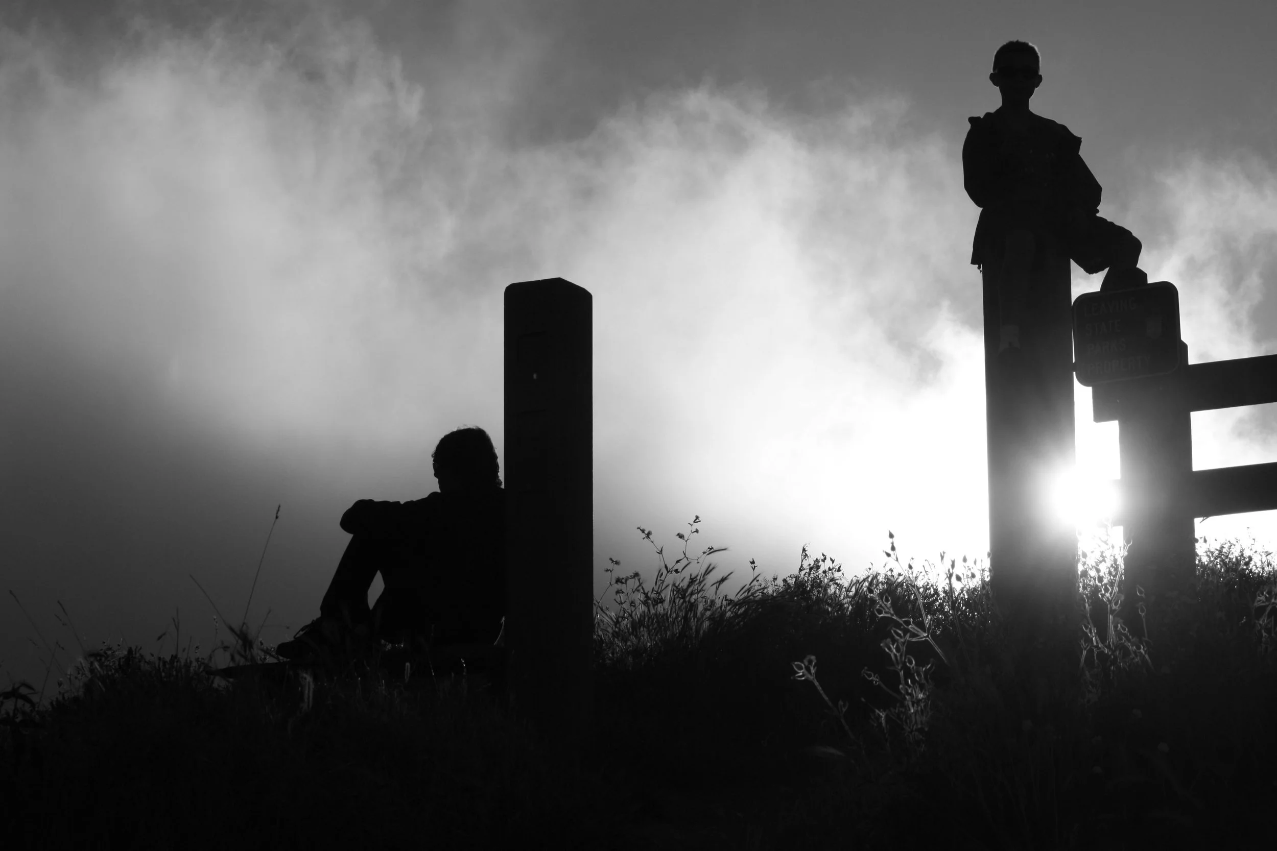
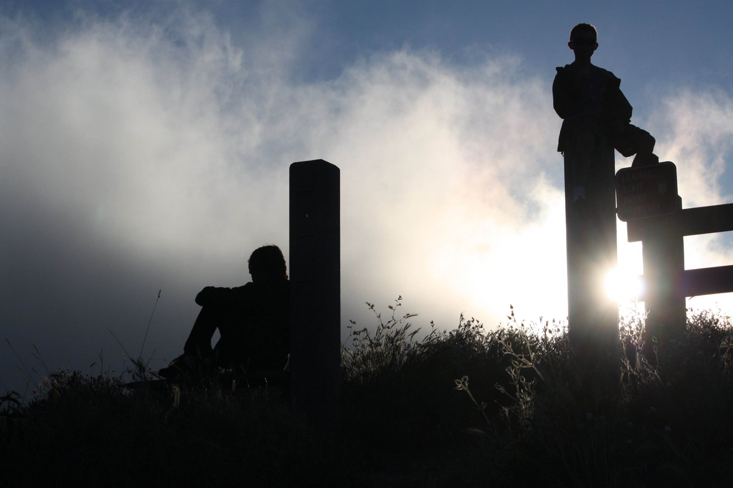
I captured my sons’ silhouette in the fog while they took a break from an early morning hike on Whidbey Island WA
No matter what your favorite art medium is, looking at the world—and taking photos—in black and white is a wonderful way to pay attention to, and appreciate the importance of Value.
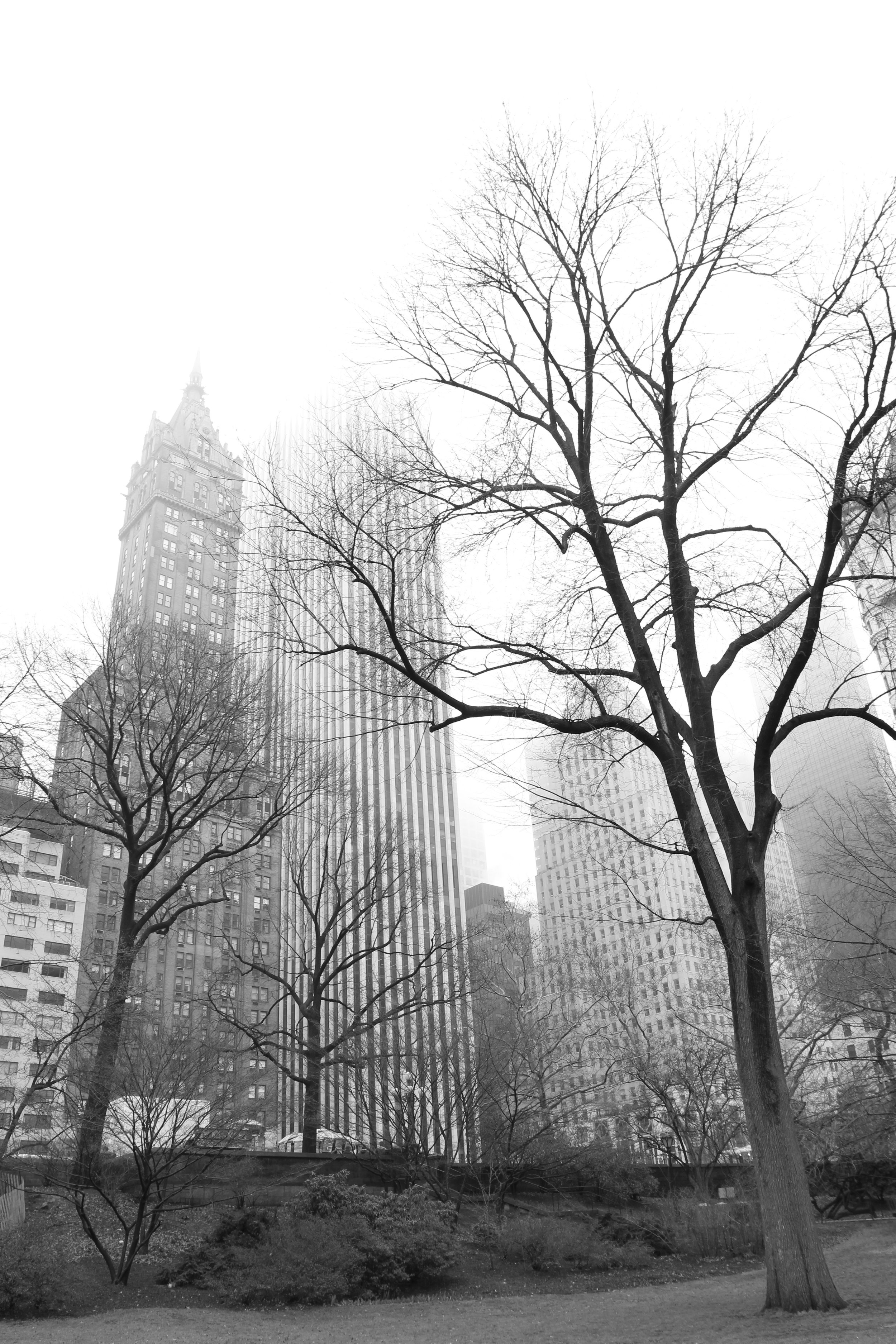
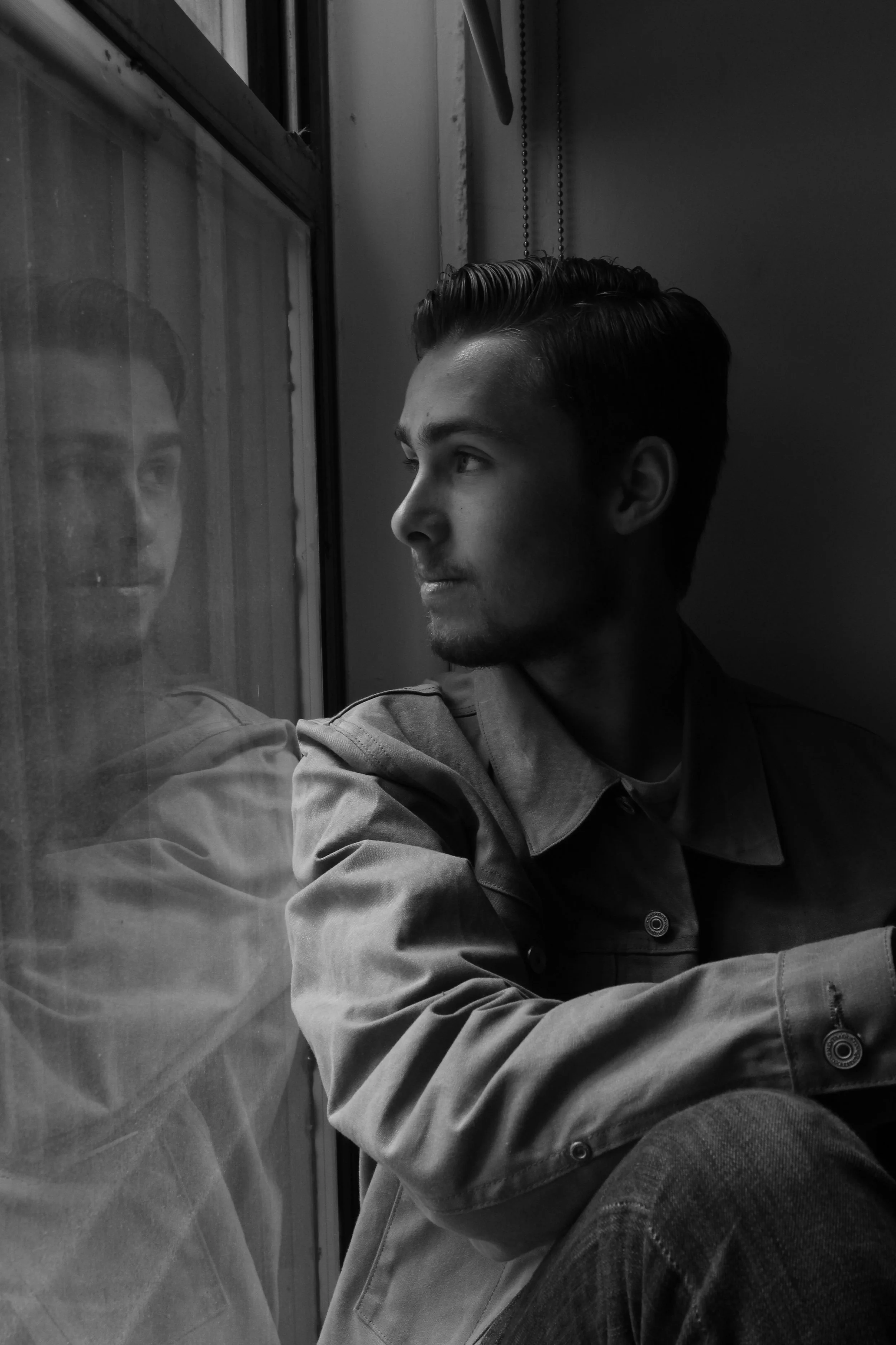
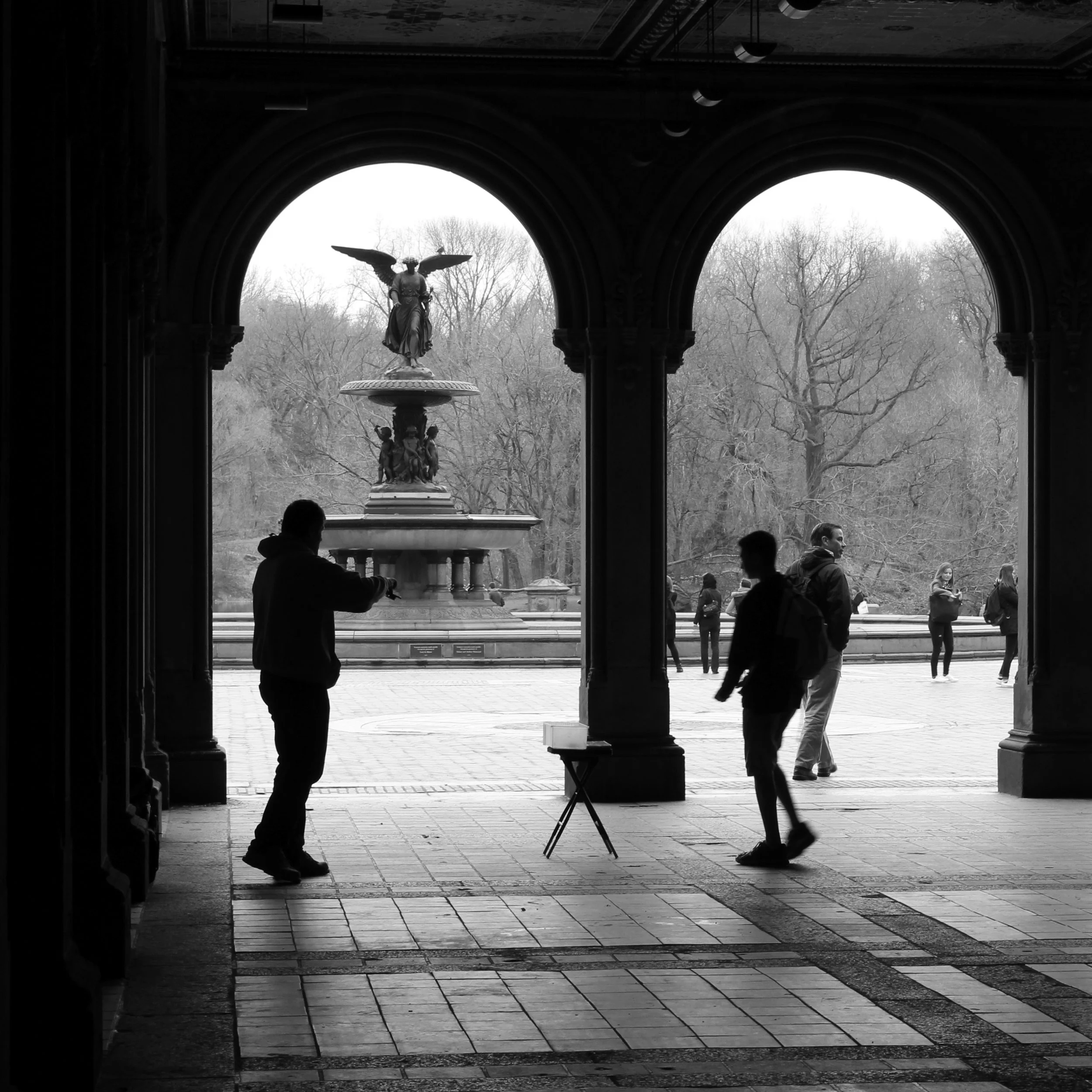
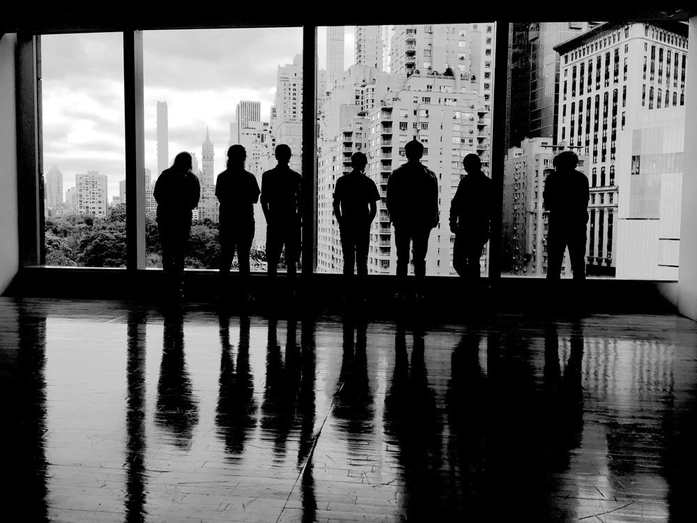
Take these snapshots I took in NYC — what a dramatic canvas for shadow and light whether it was the silhouette of barren trees in Central Park against the high rises, my son gazing out a window, or our group of young jazz musicians waiting to perform…
The Value of texture
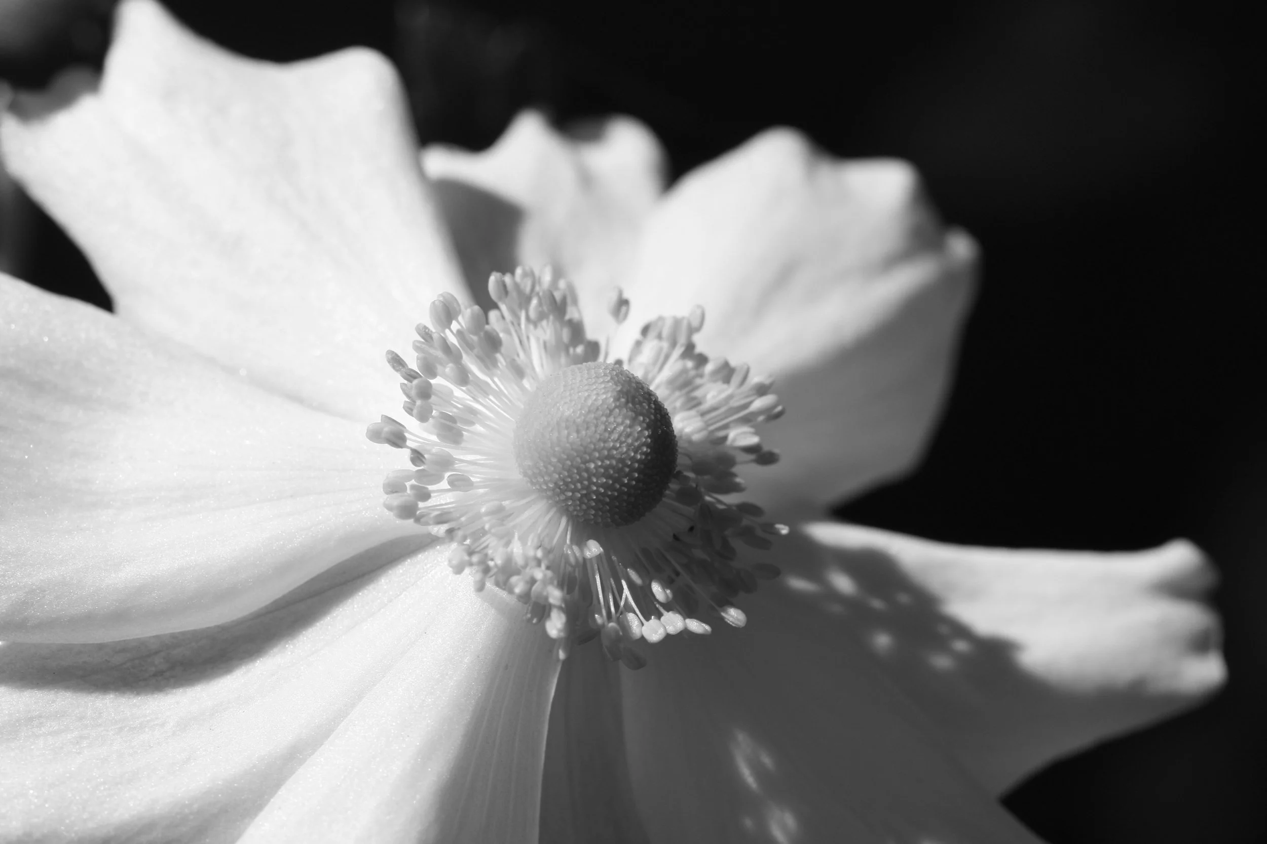
White Japanese anemone
Nature is rarely content with solid blocks of color—which is why she’s so beautiful. Even within a single color, there are always dark shadows and bright highlights. And of course, when we include different values in our own art work, it glows with texture and movement and interest.
What better way to dive into value and texture than by taking 'color' out of the equation. A plain sheet of white paper is rather boring. But it isn't that the 'white' is boring, it is the fact that a uniform color is stagnant, there is no movement on the page.
White is anything but boring
It’s all about texture…
Looking for value differences, I walked around town with a girlfriend and captured the following yummy pieces of texture (and yes, I always have a camera with me—either my DSLR or just my phone)
I invite you to look at my compilation of snapshots as a single composition (ideally on a computer screen so you can see all nine laid out in a 3x3 grid) and allow your eyes to wander. What grabs you?
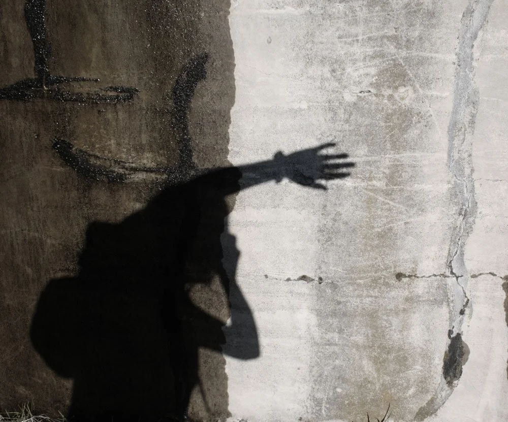

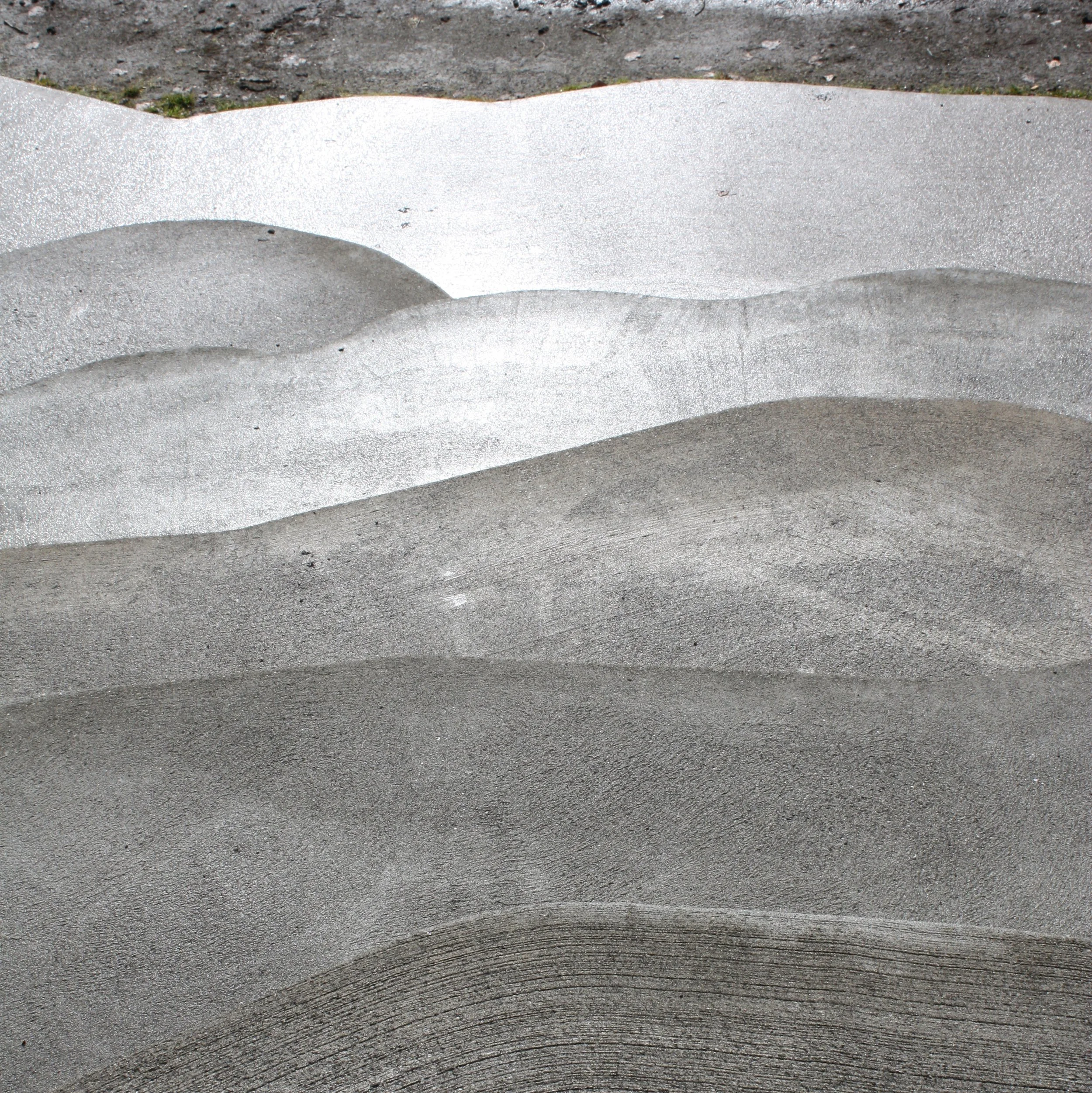
My guess is that your eye was first drawn to the area that presents the greatest difference in value (lightness or darkness) — the shadow of my arm on the concrete wall.
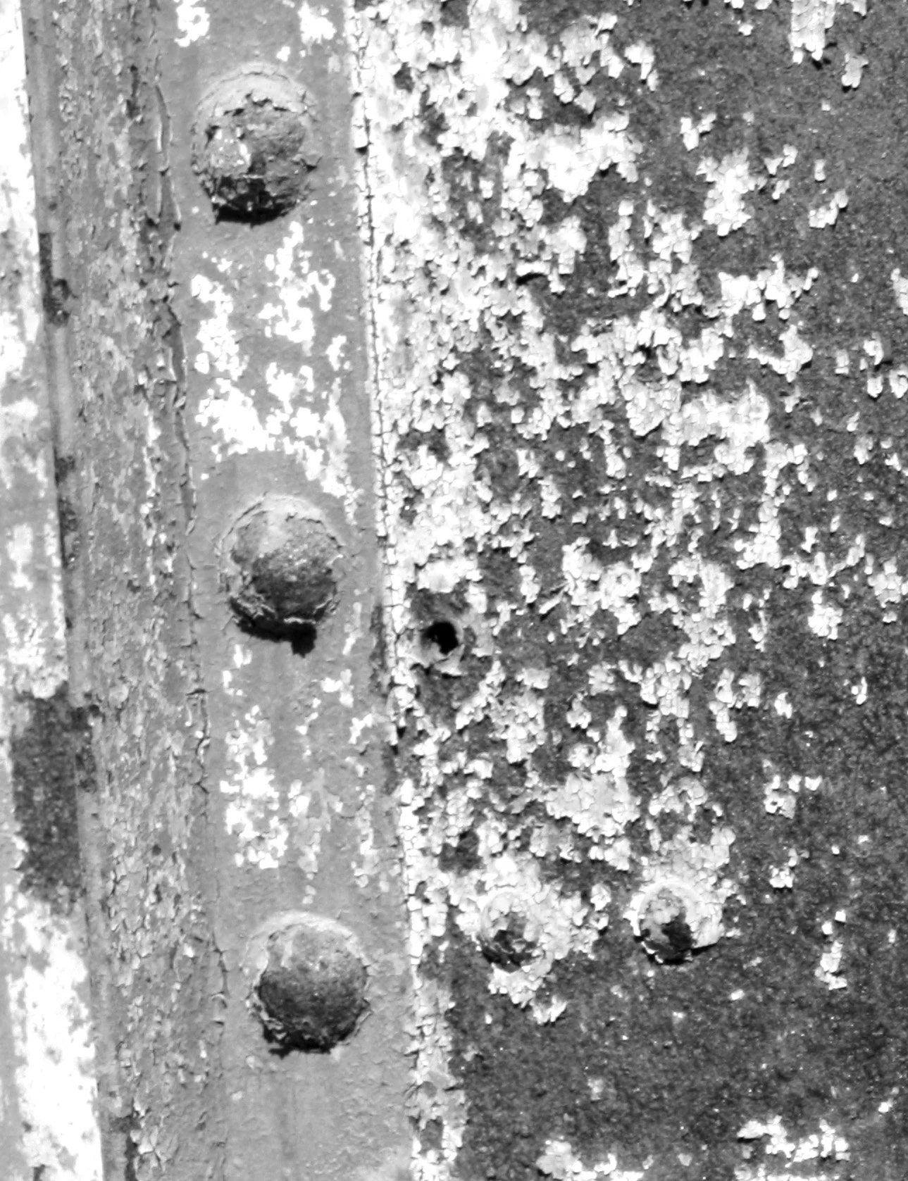
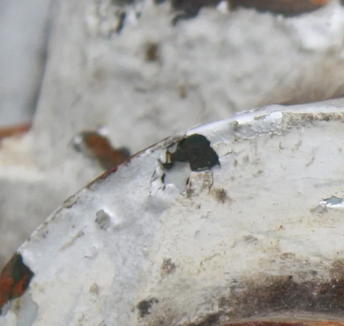
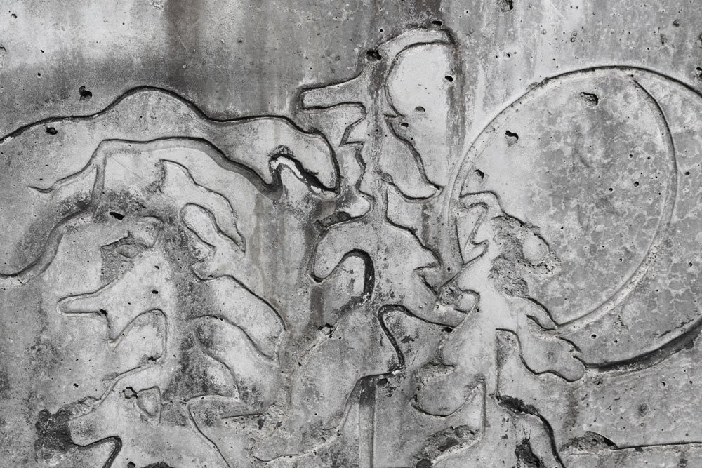
Then, perhaps you noticed other areas of high contrast such as the bit of pitted rust smack dab in the center of the mosaic, then the curved swoop of the rain-washed building.
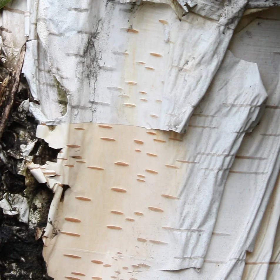
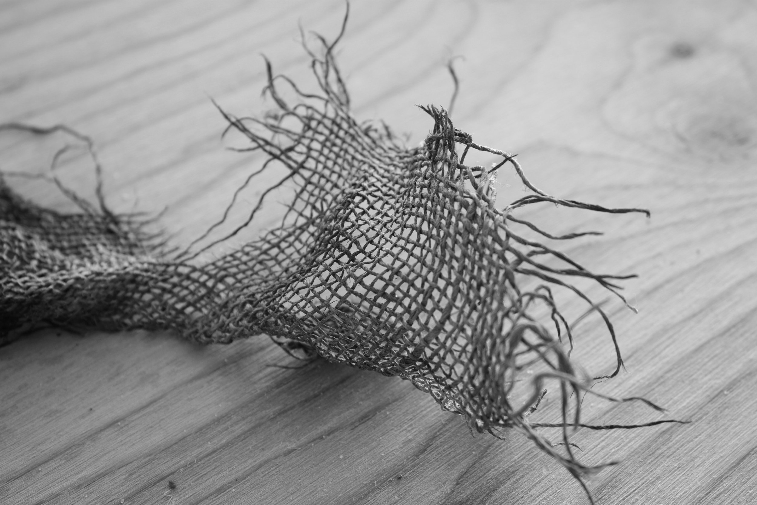
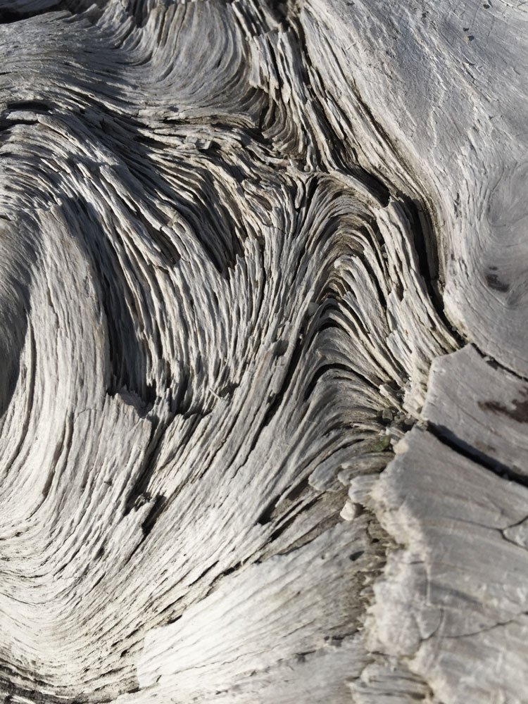
Or maybe your eye flew to the corners: the dark bark in the crotch of the birch tree in the top left, the swirls in a piece of driftwood at the bottom right, and the frayed burlap in the top right.
The goal of a successful composition is movement
Our senses are stimulated by moving from one area of high contrast to the next. Once we have absorbed the darkest darks and brightest highlights, our eyes can then take in all of the other details.
It is this mixture of light and dark values that provides us with visual texture.
Shades of Grey
If you weren’t looking for details, the birch bark or the driftwood could easily be passed off as simply 'white or maybe off-white'. However when compared with a Grey Scale, you can see how many different shades from white through grey and even black there are in each photo.

Grey Scale showing 11 shades from White to Black
Add Value to your Color Tool Box
Let’s take a Photo Walk, looking for shades of white, grey, black.
(Hint: If all you see is color, cheat by turning photos into B&W)
Notice:
stairways and paths
filtered light through the trees or blades of grass
stark lines of bright sunshine on a building
shadows, perhaps your own
reflections in water or a window
Take Notes:
How many values did you capture in each photo?
Is there movement in your photo?
Is it interesting or chaotic or boring?
Take it further:
If you’d like, compile a few of your favorites into a mosaic
Arrange them into a pleasing order
Now look for movement and texture
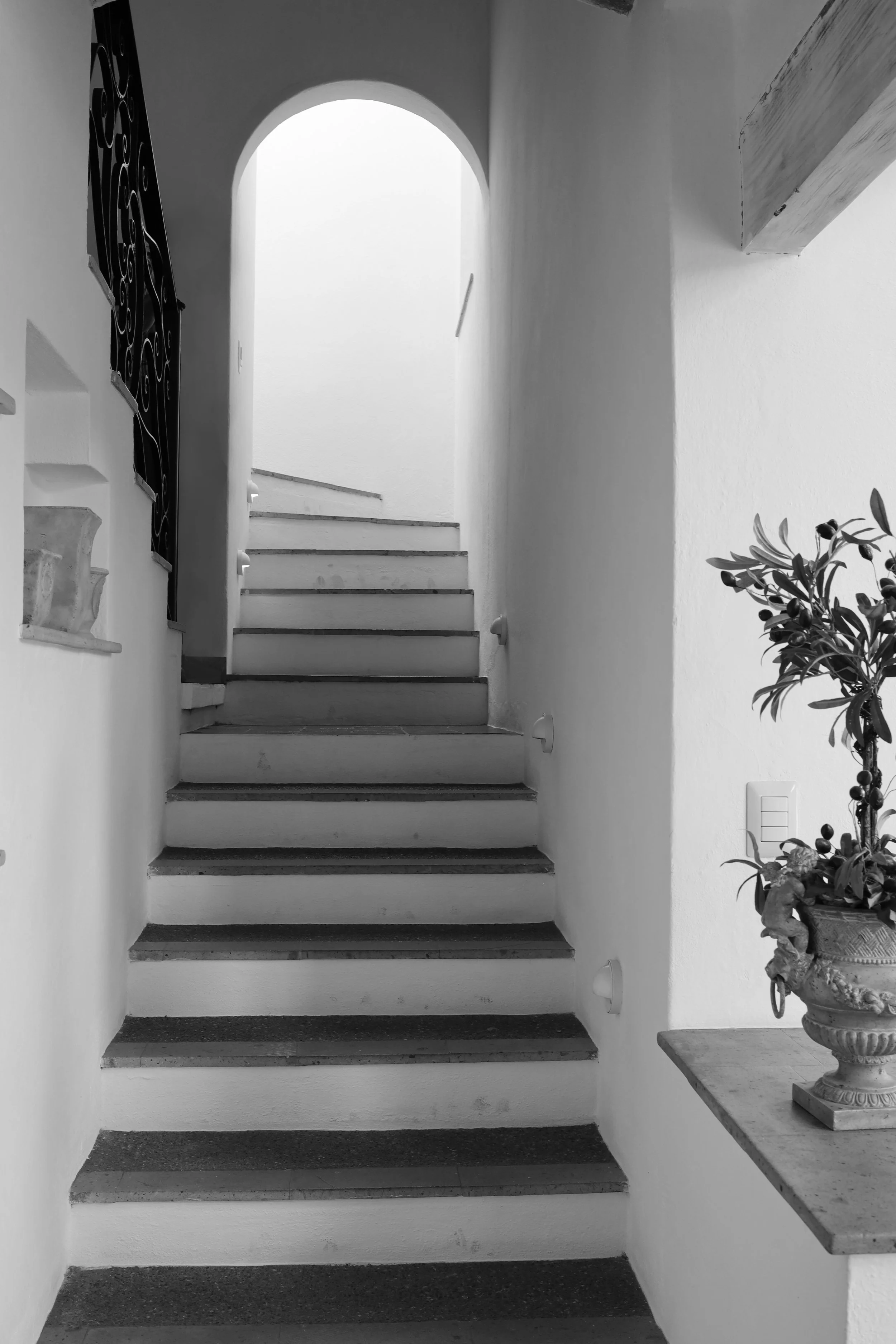
An intriguing stairway in San Miguel de Allende, MX


I hope you join me in focusing on Value! If you come up with some fabulous photos, please share and tag me (@beverlyashgilbert) on social media so I can see them.
Next time: Using value in artwork to create depth and movement…

Read more about Mastering Color: